The meaning behind melon
About the color
The color name of melon comes from the name of a family of plants with fruits that are sweet and flashy. The word “melon” comes from the Latin word melopepo, a Latinization of the Greek word meaning “apple” or “tree fruit.” The light, yellowish pink hue of melon is specifically inspired by the flesh of the cantaloupe, one of the most common types of melons. The melon hex code is #FDBCB4. This specific melon color code is sometimes identified as “melancholy,” which may be a play on the word.
Melon, which may refer to the plant or the fruit, exists as a variety of different cultivars that differ greatly in appearance. The plant originated in parts of Africa and Asia but spread to Europe during the era of the Western Roman empire. Today, people all over the world eat melons both as snacks and as part of a meal. The first use of melon as a color name in English dates back to 1892, but this particular color was popularized by Crayola in 1958.
Several different shades of melon exist. Cantaloupes are mostly known for having a more orange tone than even the shade represented by the hexadecimal code above. Other melons such as watermelon and honeydew are also common, so it’s important to confirm this shade as a requested palette for your design. The color meaning of melon is associated with several of the themes that are also connected to pink and orange. These themes include sweetness, energy, positivity, innocence, femininity, and youthfulness.
| Type | Value |
|---|---|
| HEX | #FDBCB4 |
| RGB | 253, 188, 180 |
| CMYK | 0, 0.26, 0.29, 0.01 |
Application in design
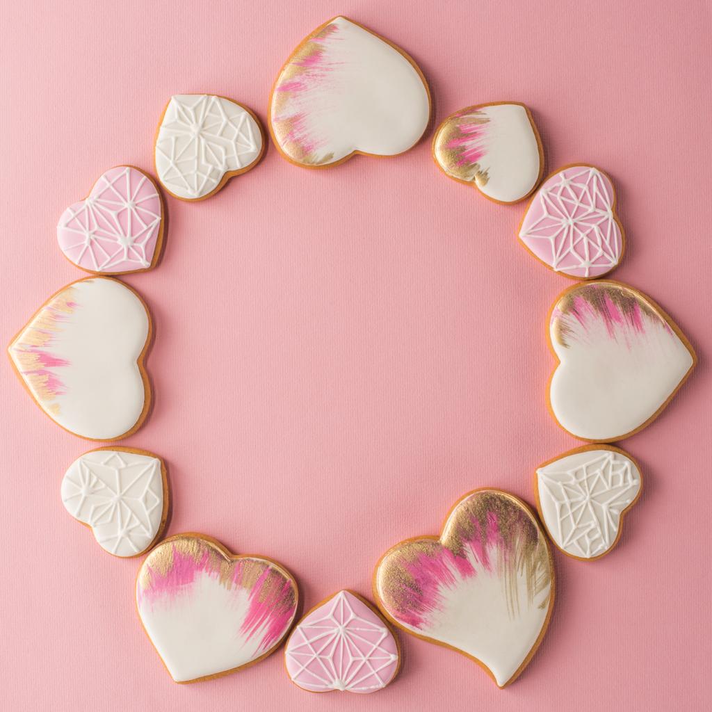
The Pantone Institute has identified a melon shade that has a more orange tone, reminding you to confirm your background, foreground, or base colors for a project based on melon. The yellowish-pink tone of melon makes it a great substitute for yellow, pink, or orange. Use it as one of the major colors for graphics related to a child’s birthday party, a springtime event, or presentations related to Easter and other holidays in the spring months. You can also use melon for a pastel palette.
The complementary color for melon is a dark blue-green color. The contrast in these shades is well-suited for the readability and visibility of text and other fine graphic details. This pink and dark blue-green combination also offers a vintage or antique spin to a romance-based design project. Graphics for a wedding event, a school prom, or a sweet sixteen birthday party would look great with this melon and dark blue-green motif.
Melon also works well with pale yellows, greens, and other oranges. Create an aesthetic about wellness, health, and nutrition with these pairings. These design approaches play up the youth and energy associated with new growth, cultivation, and development. You can also use melon to tone down more vivid colors, especially pink and orange.