The meaning behind pastel blue
About the color
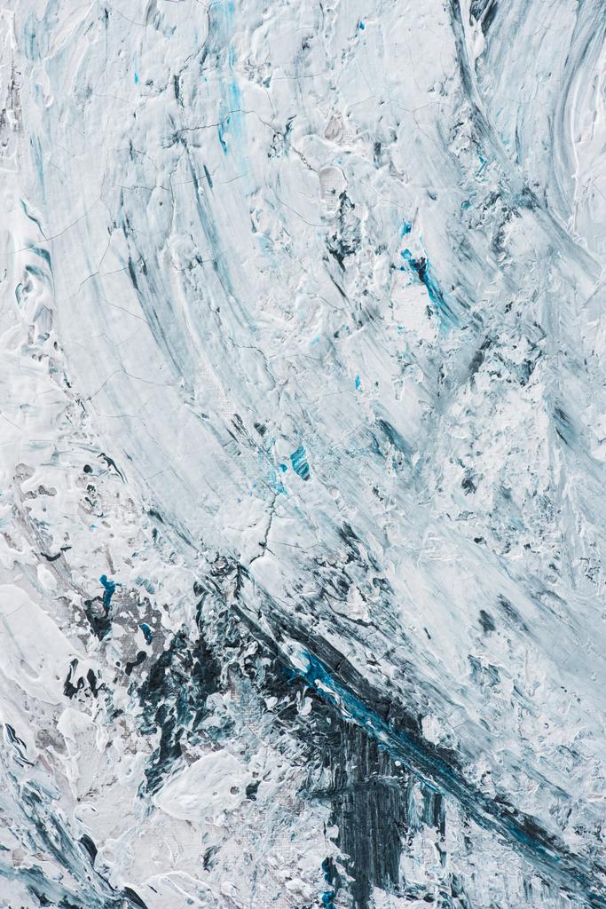
Pastel blue is a light blue shade with an RGB value of 174, 198, 207. The hex code for pastel blue is #AEC6CF. This cold and gentle color is achieved by adding a little blue paint into a white base.
Pastel blue is similar to different shades of blue, for example, powder blue, light blue, or sky blue. Though the color name “pastel blue” is often used as a synonym for “baby blue,” they are considered different colors in the hexadecimal chart. A pastel blue color scheme is more muted than bright baby blue shades.
The meaning behind pastel blue as a color name has to do with pastels, a powdered pigment used to create soft, low saturation hues. Pastels as an art medium became popular among artists in the 18th century.
Pastel blue and other pastel colors were used in art, architecture, and other areas in the Rococo era. For example, Marie Antoinette, the Queen of Versailles, preferred pastel shades. That’s why we often see her in pastel blue gowns in many portraits.
A pastel palette was also popular in the 1980s, due to the hit show Miami Vice, where muted hues were featured prominently. Nowadays, pastel colors are widely used in architecture; many famous instances can be seen in Miami, Cuba, Spain, and Morocco. In addition, pastel blue and other muted hues like pink, lilac, and others are popular in fashion and graphic design.
| Type | Value |
|---|---|
| HEX | #AEC6CF |
| RGB | 174, 198, 207 |
| CMYK | 0.16, 0.04, 0, 0.19 |
Application in design
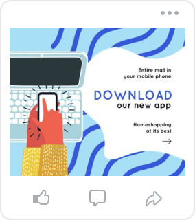
The color meaning of pastel blue is peace, solace, and harmony. Plus, due to its similarity with pale blue shades that babies are traditionally dressed in, pastel blue also represents youth and innocence. It’s a good solution for baby stores and kids’ clothing brands, so use a pastel blue color scheme for social media pages, ads, and website design related to this topic.
Like a huge number of other blue shades, pastel blue is associated with trust, reliability, and honesty. That’s why it is also a good choice for a business logo design.
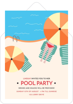
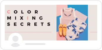
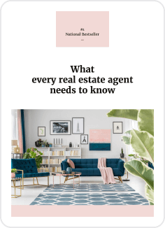
Pastel blue is a soothing and muted color, and this makes it suitable for usage in large amounts. Add more color to your design without it feeling overwhelming with a splash of pastel blue. Pastel blue is perfectly complementary with neutral and soft colors, like beige, nude, cream, etc. Create a fashion-forward combination by pairing pastel blue with other pastel shades. Liven up this pale color, match it with fresh coral.
Create harmony in your visuals with a pastel blue color scheme.


