16 magazine covers and how they can inspire your designs
The key purpose of a magazine cover is to generate sales… Wait, what? No, the key purpose of a cover is to attract the attention of your target audience. Which can, in turn, lead to an increase in sales.
When crafting your magazine cover, you want your design to be an image that both generates interest and transmits the core theme. Tough task? Indeed.
Luckily, there are tons of creative magazine covers out there for your inspiration. This piece will examine some of the best ones starting from 1923 — and offer a number of actionable tips and ideas for your magazine cover designs.
16 magazine covers for your design inspiration
Let’s go straight to the good stuff and examine magazine cover ideas from Vogue, Bloomberg, the National Lampoon, and other famous issues.
Create engagement and add a call-to-action
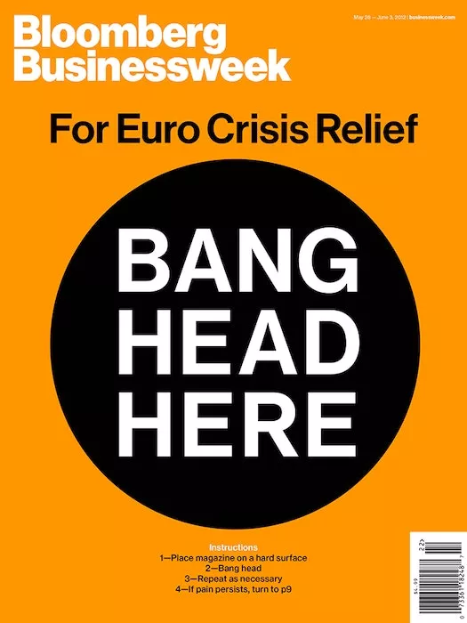
What can you do with a magazine cover other than read it? Bloomberg says: bang your head. This magazine cover page instantly creates engagement with the reader, providing a place to bang one’s head for Euro crisis relief.
The cover artists also added a great combination of contrasting colors that accentuates the call to action.
Go no makeup
Though it may seem like a typical magazine cover, it’s not. Aren’t we all just sick and tired of Photoshopped covers? Especially with iconic celebrities that seem like they’re too cool for this world…
Rolling Stone magazine decided to switch things up by featuring Adele on the cover with no makeup. Or, at least, it seems like she has no makeup on — perfect, humble, natural.

Use handwritten styles
Kids’ handwriting holds a robust source of inspiration for design projects. In this Guardian cover, the designers used a simple font that looks like it has been casually handwritten by some of your nephews. And note how it clashes with the text itself and the background picture.
The designers obviously want us to panic over climate change — and used mild elements for this creative magazine cover to ensure contrast. Digital art at its purest.
Looking for a great font for your magazine cover? Explore our take on everything you need to know about fonts.

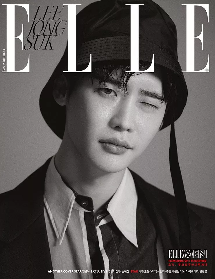
Go black and white
Black and white is, perhaps, one of the most powerful color combinations out there. It allows you to create contrast, maintain proper visual hierarchy, and emphasize the most important parts.
With Elle’s main image, all you notice is the subject’s face, thanks to properly arranged light. Beautiful photography, right? And he’s winking at you!
Pay homage to surrealism
Famous art movements are the perfect choice if you need inspiration for your magazine cover — that’s the case with National Lampoon. For your designs to project a surreal mood, find inspiration in the works of Salvador Dali and other masters.
All in all, the cover just leaves you questioning — why is this eye here? Is that a tooth? And makes you want to read the full issue. We wish we could get a monthly subscription!

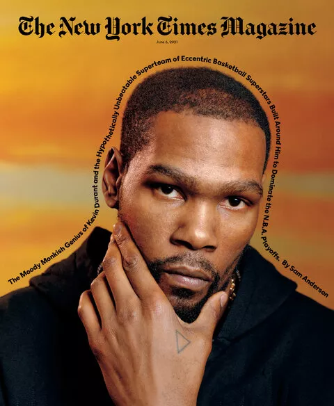
Mix photography and text
Sometimes, there’s no need to put text in paragraphs, logically arranging them on the magazine cover. Make the text follow your image. This way, you’ll accentuate the photo itself, and create a path for the reader.
Also, on this The New York Times magazine cover, we note a simple, gradient-like background that is a little blurred to emphasize the photo for the reader.
Use color accents
Nothing works better than a proper accent. This National Geographic cover features a girl in pastel colors, eating something with a red lip.
Note how the lipstick is applied unevenly. Often, in magazine covers, it’s this one unconventional element that creates all the drama — and makes you want to explore the magazine’s content.

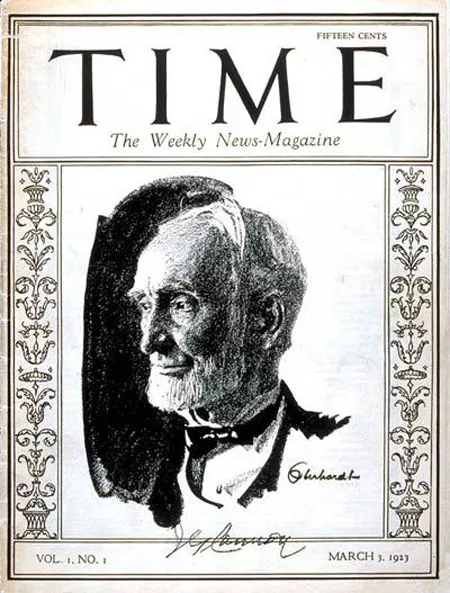
Sketch it out
Sketches are great, period. Back in 1923, photography wasn’t as accessible — so magazine cover designers used sketches. We love how this portrait of US Congressman Joseph G Cannon manages to transmit emotion and the expression in his eyes.
And what’s that void behind him? Is that a mirror or a wall? No one really knows.
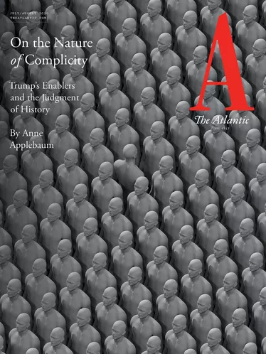
Use patterns
Need some space? Use patterns. Patterns are a well-known type of white space, which can create a sense of lightness for your reader.
With this Atlantic cover, the designers are using a gray pattern that seems quite conventional, until… You notice there’s a figure that stands out. Sometimes, it will take your reader some time to understand the idea behind a cover. And this is the essence of a cover — to catch the reader’s attention.
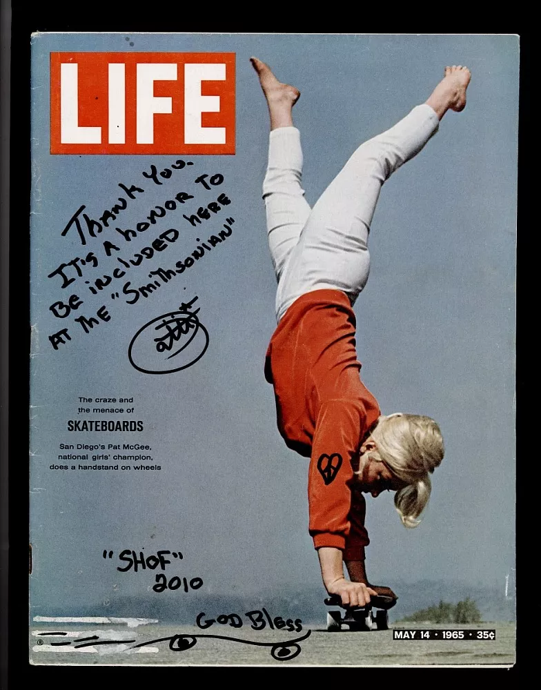
Take it upside down
Who said you have to picture people right-side up? Take it upside down! This image by Life magazine features a woman with her hands on a skateboard, creating a perfect, fearless photo.
Note the color palette here, with red being both the logo of the magazine and the color of the woman’s clothing.
Want a similar palette for your magazine cover? Take a look at our retro color palette.

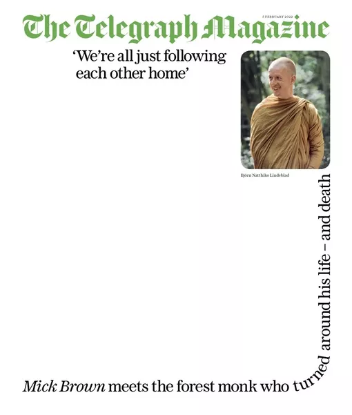
Use blank space
Sometimes, for a great magazine cover, you just need plenty of blank space. Take a picture, include powerful quotes, and add lots of negative space — you get one of the most perfect cover designs out there.
We also appreciated how the designers decided to use green to project trust, growth, and calmness.
Experiment with neon
In some cases, all you need is neon. Thanks to color choice, this cover of GQ magazine is somewhat psychedelic, and that’s what we love about it.
Add the beautiful, ghostly font of the sub headings — and you get one of the most iconic magazine covers out there.

See if our neon color palette tickles your fancy 😉

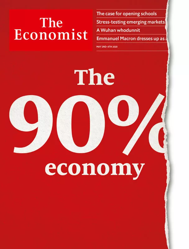
Create emphasis with size
In magazine covers, it pays to make a certain object bigger to emphasize its importance. Way bigger. Size is your go-to option when you want the reader to instantly pick up on the key idea of your magazine cover.
Note how 10% of the magazine cover is eaten to complement the idea of the cover.
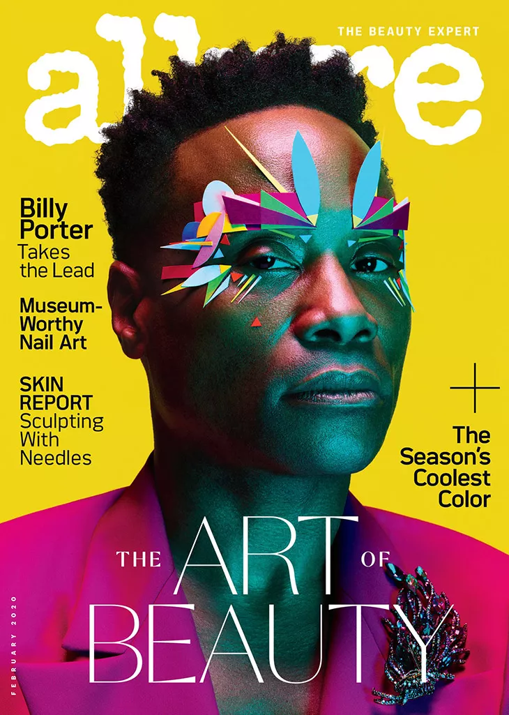
Use contrasting colors
We just love the combination of yellow and purple in this Allure main image. According to color theory, this is one of the most powerful combinations that creates contrast and builds accents.
For your next designs, consider complementing colors like red and green, or orange and blue.
Create mystery
The New Yorker is famous for its amazing illustrations. This one from May of 2021 is no exception. Not only does it create color contrast, it also implies mystery by not fully showing what’s behind the closed door.
Add the iconic font of magazine title — you get the perfect cover.

Be brave like this Vogue cover
We’d like to applaud the whole magazine team, Annie Leibovitz, and Ukraine’s First Lady Olena Zelenska for rolling out this outstanding Vogue cover. It’s perfect in its simplicity and disregard of conventional norms.
What if a First Lady sits like this? What if she makes direct eye contact with you? What if she’s pictured with sand sacks in the background to depict and remind readers about the ongoing war in Ukraine? This cover has recently made headlines on social media — and we think that’s for a reason. It represents a true portrait of bravery — and we urge you to be brave in your artworks, too.

We can’t wait to see yours among the most creative magazine covers. Head over to VistaCreate’s library of templates and create your cover in minutes.