Everything you need to know about fonts
It’s so easy to create a design with VistaCreate. Just pick a high-resolution photo or video, throw a couple of design objects, and write your message. However, when selecting a font for your masterpiece, you might wonder whether the fonts match. If they don’t, they will mess up the whole thing.
VistaCreate media library has hundreds of fonts in 20 languages, and they’re all free to use in your art. Moreover, if you have your brand fonts or the ones you’ve got from other platforms, you can upload them to VistaCreate and use them while designing. Add fonts to your custom Brand Kits and apply styles to the canvas even faster!
In this article, we answer all significant questions regarding the types of fonts and how to pair them. All the images demonstrate real fonts that are available in VistaCreate.
Why fonts are so important in graphic design
Fonts are the way of expressing your message. It would be much easier if we all just used good-old Arial everywhere but would it be that fun? If you want to be unique and make sure your message is perceived the way you want, style it smartly.
Common issues with fonts that can mess up even the most beautiful design:
- Too many fonts. Usually, you know this right the second you see a design. You surely can use several fonts, depending on the amount of text on the visual and your personal or business goals. Still, don’t get crazy, there is a golden ratio here, and it’s up to three fonts on one visual (better two).
- Poor font choice. This might happen when you browse fonts and see how they look just on a single word. Then, you apply it to a text paragraph and see that it looks completely different from what you’ve expected. Bold fonts might look too bulky when there’s a lot of text, while thin fonts are too weak for headlines. Choose fonts based on the amount of text.
- Out-of-context fonts. For example, you don’t expect to see a memoir about war written in a Clicker Script font. The same rule with every message you need to style—pick a font depending on the context, not just the looks.
You can avoid these common mistakes just by learning a bit more about fonts, what differentiates them, and what they’re made for.
Five major types of fonts
There are many fonts to choose from for your designs. Some are old classics, and some are made by modern graphic designers who are into typography. Before you proceed with the graphic design process, it’s essential to understand the differences between fonts to pair them well.
The first time I drew type, I felt like I was at the bottom of Mt. Everest. In a swimsuit.
—Nina Stössinger, typeface designer at Frere-Jones Type, critic at Yale School of Art.
Serif fonts
These are the fonts that have tip strokes, “serifs”. There are tons of serif fonts for any type of design, from old-style “Roman” fonts (the second less popular name of serif fonts) to transitional “baroque” fonts, and finally modern “Didone” serifs.
Typeface designers and typography experts can differentiate old and new serif fonts by a quick peek. To compare serif typefaces from different periods, look at old classic Sabon, transitional Perpetua, and modern Didot.
The difference is not obvious, but it is there:
- Older serif fonts have lower contrast between their thin and thick elements. Most of the old fonts have pretty short, not very distinct serifs.
- Transitional fonts are a mixture of old and neoclassical techniques, combining serifs with a bit thinner but still very distinct lines.
- Modern fonts usually have a combination of thinner lines and serifs with rather bold lines. Didone fonts are often used in fashion magazines and other media for titles and subtitles.
Serif typefaces are great for printable materials such as books and magazines but also work stunningly for digital visuals because they look rather calligraphic while remaining easy to read.
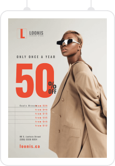
VistaCreate has hundreds of serif fonts to choose from for your designs! Antic Didone typeface is one of the prominent representatives of this font style.
Sans-serif fonts
Serif fonts had to naturally evolve into something sharp and modern, especially in the era of news and advertising, when the need to make headlines more catchy became crucial.
You probably already guessed that “sans” means “without”, so sans-serif (or shortly “sans”) fonts have bold, more even baselines without any tip strokes. The great examples of sans-serif typefaces are News Gothic, Helvetica, Century Gothic, and “very much loved” Calibri.
Sans-serifs evolved from old to modern versions very similarly to serif typefaces. They used to have thick uniform lines, which later turned into a play of thick and thin elements and more subtle humanist details.
Apart from headlines, sans typefaces such as Arial and Proxima Nova are often used for body text as well.
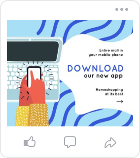
Browse through hundreds of sans-serif fonts in VistaCreate, such as the Prompt, and use them for styling body text or bold headlines.
Slab serif fonts
Simply put, slab serif fonts (or just “slab”) are the ones that have strokes like serif fonts, but these serifs are more extended, more chunky, distinct, and abrupt.
Most of the monospaced fonts (where each letter occupies the same amount of space) used in typewriters and computers are either slab or sans font families, such as Courier and Lucida Console.
The great examples of slab serif fonts are American Typewriter, Rockwell, and Clarendon.
Lora is just one of the dozens of slab serif fonts available in VistaCreate to make your designs even more confident!
Script fonts
Script fonts are the ones that come from handwriting. Older script fonts are neat, usually slanted, written in cursive, while today’s script fonts are more casual and creative, including regular and bold font-weights.
The great examples of script typefaces are Snell Roundhand, Brush Script, and Kaufmann.
Browse script fonts in VistaCreate and apply them to text blocks in your designs which you want to highlight. For example, Playlist Script typeface can spice-up your visual with its happy-go-lucky nature.
Decorative & display fonts
Display typefaces are a modern take on all regular fonts but with the only aim—to highlight your message to the maximum. These fonts are not suitable for body text because they’re made for headlines.
Decorative typefaces include all of the abovementioned writing styles: serifs, sans-serifs, slab serifs, and script fonts.
Good examples of display typefaces are Broadway, Bauhaus (it was indeed inspired by the Bauhaus aesthetic), Peignot, Stencil, and Windsor.
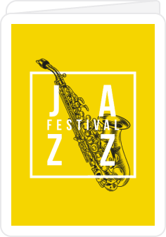
There are lots of decorative fonts in VistaCreate, and everyone will find their perfect match. Sigmar One is just one example of the hundreds of available typefaces for your art.
Font pairing practices
There are just two ways to pair fonts, not millions, as you might think based on the number of existing fonts these days. You can pair fonts from the same typeface and different typefaces. But first, it’s good to understand the difference between a typeface and a font.
Typeface—is a family of fonts that usually includes but is not limited to regular, bold, and italic font variations. Sometimes, typefaces include just regular and bold font-weights, while others might have more additional styles such as extra bold, light, condensed, extended, and more.
Font—is a typeface variation of a particular style, weight, and size. Back in the days of traditional typesetting, fonts were made from metal or wooden plates. Modern-day fonts are digital files that you can download from special font marketplaces or directly from particular typeface designers.
Use fonts from the same typeface
Moving on to the pairing practices. The easiest and probably the most successful way to style text in your designs is to use fonts from one typeface. You simply can’t go wrong with this concept. It’s pure minimalism. However, pay attention to the style of a typeface. Display fonts are likely to make your design a bit heavy if there’s too much of them, so consider serif, sans-serif, and slab serif fonts.
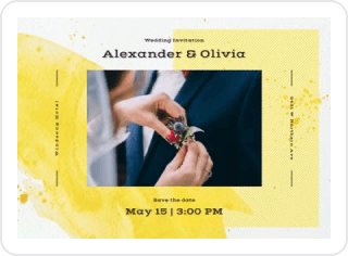
In the example below, you can see how VistaCreate designers played with this technique to create a template with four different text blocks but only one typeface. Serif typeface Radley is an excellent choice for both capitalized headlines and lowercase body text. It also has italic and underlined font-weight variations.
Try fonts from different families
It sounds a bit off, but fonts from different families sometimes match even better than from the one. But be careful, not all of them fit! The best way to nail the technique is to try them on your design and see if they match. The more you practice, the more successful you’ll be at font pairing.
The example below shows how you could use two completely different typefaces in one design to emphasize important details. VistaCreate designers combined Montserrat and Mr Dafoe typefaces to create an eye-catching marketing visual. The Montserrat typeface’s bold font is a perfect choice for both headlines and body text, while Mr Dafoe’s cursive technique doesn’t require additional formatting and is used in a regular font-weight.
Script typefaces are perfect for all lovers of handwriting. However, they’re often quite hard to read, especially the ones in italics, so it’s better to combine them with regular fonts for balance. Try to follow the Pareto principle for this technique: 80% of easily readable text, and only 20% of decorative, script, blackletter, stencil, or other “screaming” typeface style.
Wrapping up
Text is one of the first things people notice when they first see your design. The choice of fonts plays a crucial role in how the audience perceives your work. You can control people’s reactions with different fonts, which is a powerful tool in a creator’s hands to make dazzling marketing materials.
➡️ Check out our article to learn about the best free fonts for your designs.


