The meaning behind bordeaux
About the color
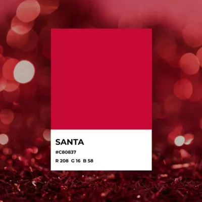
The color name for bordeaux comes from the wine that is named for the southwest region of France where it’s made. Bordeaux is a very dark red color with brown undertones very similar to the wine. The beverage is one of the world’s most popular wines. It is sourced from a blend of several types of grapes grown in the Bordeaux region. As a result, there are different types of Bordeaux wine, including a white variety. The vast majority of these wines are red in color. The bordeaux hex code is #5A002C.
The history of the wine dates back to the 1st century when Romans introduced it to the Bordeaux region, where it has been produced consistently since. Bordeaux wine became very popular in the 12th century with the marriage of King Henry II of England and Queen Eleanor of France. Producers began to export the wine to England. Today, 700 million bottles of wine are produced on average, ranging from everyday household use to that of some of the world’s finest and most luxurious brands.
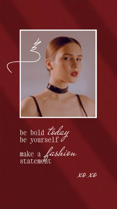
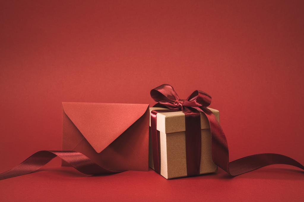
As a color, bordeaux is sometimes noted as bordeaux red. Different shades of bordeaux exist based on the products being used. Confirm that you’re using the proper bordeaux color code, which has a deep, somewhat saturated appearance, similar to burgundy. In British English, the term “claret” is sometimes used for the color of Bordeaux wine. The color meaning of bordeaux is based on the wine’s history, conveying themes of luxury, elegance, romance, passion, royalty, and refinement.
| Type | Value |
|---|---|
| HEX | #5A002C |
| RGB | 90, 0, 44 |
| CMYK | 0, 1, 0.51, 0.65 |
Application in design
The Pantone Institute has a bordeaux color that is less saturated and has a different hexadecimal code, but they can offer advice on ways to use this shade in your project. Bordeaux is a dark color, so if you’re using it as a background or base color, you’ll need lighter colors for contrasting text. Bordeaux is similar to maroon, but reads as more romantic and elegant, thanks to the pink tones. Use it as a substitute for brown to add a romantic vibe to a project meant to evoke home and warmth.
A light, mint green color is the complementary color for bordeaux. Pair with this mint color and a medium-light brown for a masculine theme with a touch of elegance. A combination of bordeaux with hunter green or gold also works well for a graphic project related to products and services that appeal to men.
For a more feminine theme, use bordeaux with pinks and creams. Roses and greyish-pinks make for elegant themes when used with bordeaux. A very youthful or light color such as pale yellow or pink can be anchored with bordeaux. For a more intense pairing, create a palette that includes bordeaux with orange, lavender, or saturated pink to emphasize taste, flavor, and boldness.