The meaning behind deep pink
About the color
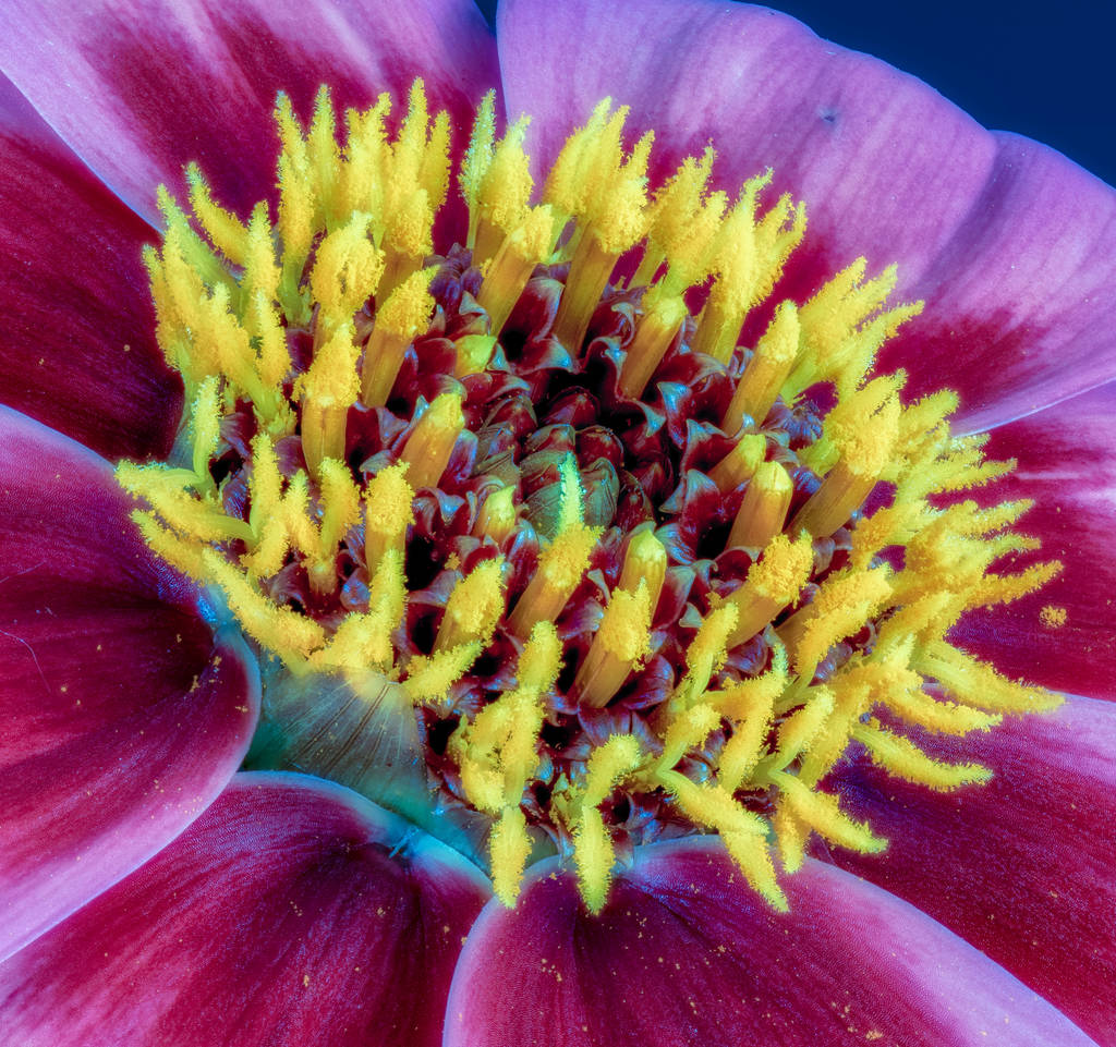
Deep pink’s color name comes from flowering plants in the Dianthus genus called pinks, known for their frilled edges. The name of the shade is also a reference to its intensity, as it looks like a combination of magenta and pink or a purplish-red. Pink is usually a mixture of red and white, varying from pale and desaturated to rich and intense. Pink has been used as a color since the 17th century in Europe. The deep pink hex code is #FF1493.
You can find descriptions involving the color pink dating back to ancient times, especially related to the morning sky. During the Renaissance period, pink was the color used most for flesh for faces and hands, achieved through a mixture of red earth and lime white pigments. It wasn’t until the 18th century that pink began to show up as a popular color in fashion, especially as a pastel color. For the inauguration of President Dwight Eisenhower in the 1950s, his wife Mamie wore a pink dress, and many consider this to be a key moment for pink’s designation as a feminine color.
Intense pink shades such as deep pink are often connected to pop culture in the 1980s and 1990s. A deep pink color meaning can include femininity, girlishness, childhood, romance, sexuality, and passion. Whereas other pink shades may suggest softness, you eliminate that softness with the intense hue of the deep pink color code. Other themes conveyed by deep pink include energy, vibrancy, vitality, and electricity.
| Type | Value |
|---|---|
| HEX | #ff1493 |
| RGB | 255, 20, 147 |
| CMYK | 0, 0.92, 0.42, 0 |
Application in design
The Pantone Institute is a widely respected authority on the best ways to implement color, offering guidance on how to work with deep pink. Similar colors to deep pink include hot pink, fuchsia, and magenta. You can substitute it for any of these colors without altering the mood or feel of your design. Due to the intensity of deep pink, you should be cautious about using it as a background or base color. You can soften it with whites, creams, and lighter pinks for a more innocent touch, or intensify it with black for a more adult theme, especially one that is erotic or risque.
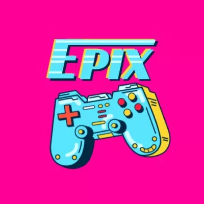
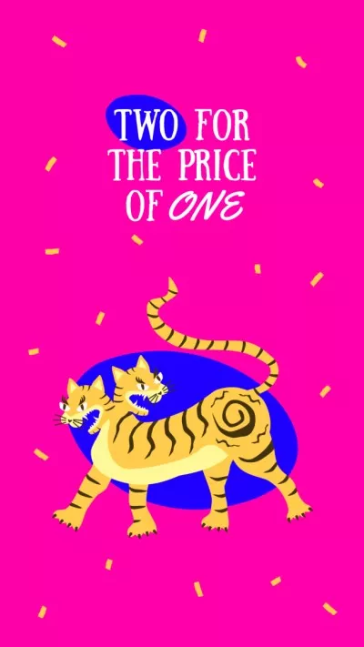
Deep pink has a minty aqua tone as its complementary shade. Pairing pink with this color or with vivid blues and oranges is great for graphics related to children, movement, and high energy. If you’re creating a project to evoke the ’80s and ’90s, deep pink is a strong choice as an accent color. Think pop music, exercise videos, feminine sports gear, and dance.
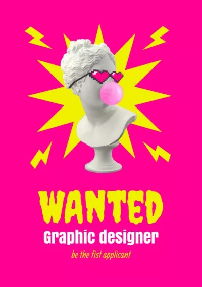
Pink is also widely viewed as a flamboyant color. In illustrations, deep pink tones are often used for neon lights and flamingos. If you’re creating a palette that is over-the-top and bold, deep pink reliably conveys that mood. This intense pink color is also appropriate for projects related to fashion, bold style, and cosmetics. Thanks to the pink triangle being a symbol of gay rights, deep pink is also fitting for projects related to Pride and queerness.