The meaning behind very peri
About the color
Very Peri was named the main color of the year for 2022. It is the first time Pantone created an absolutely new shade for its color of the year, instead of choosing from its pre-existing library of colors. The hex code for Very Peri is #6667AB.
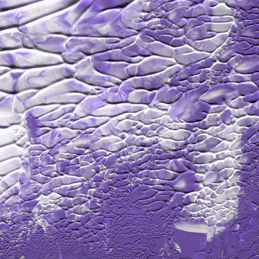
Very Peri is a combination of different shades of blue and deep violet with red undertones. This is a mix of confidence and permanence, with energy and curiosity. The color name is derived from “periwinkle” — a flower in the blue and violet family. The main symbolism behind Very Peri is creativity, individuality, and personal inventiveness.
As the company said, Very Peri represents “an empowering mix of newness.” The color meaning is all about innovation, global transformation, and an original approach to everything. In graphic design, a Very Peri color scheme evokes the creative spirit and intrigues viewers.
| Type | Value |
|---|---|
| HEX | #6667AB |
| RGB | 102, 103, 171 |
| CMYK | 0.4, 0.4, 0, 0.33 |
Application in design
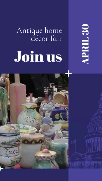
Before choosing the color of the year, Pantone Institute experts analyze tendencies and trends in different areas: design, marketing, art, business, economics, creative industries, and more. That’s why Very Peri will definitely be a winning choice for branding. Use Very Peri and similar shades to create trendy designs and promote your business.
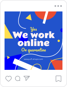
Because Very Peri is an inspiring color, you can use it in your concept maps, mood boards, and other visual presentations to win over potential customers or partners. Besides, this color palette is very innovative and bright, so it is suitable for a website, blog, or social media if your target audience is young.
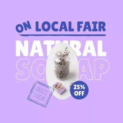
Very Peri is very close to different shades of lavender, and they are known to have a positive impact on people. As Pantone experts say, it’s the color of happiness. That’s why a Very Peri color scheme is a good choice for brand identity, especially merchandise. People will fall in love with your merch, and your brand will become more recognizable.
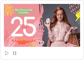
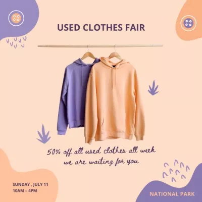
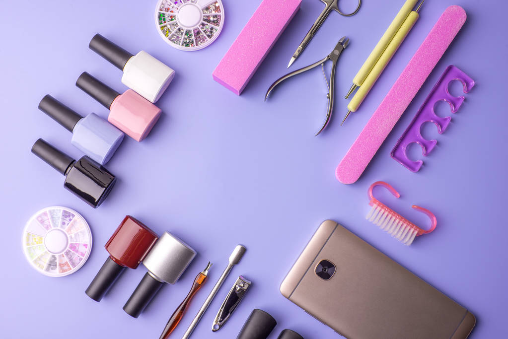
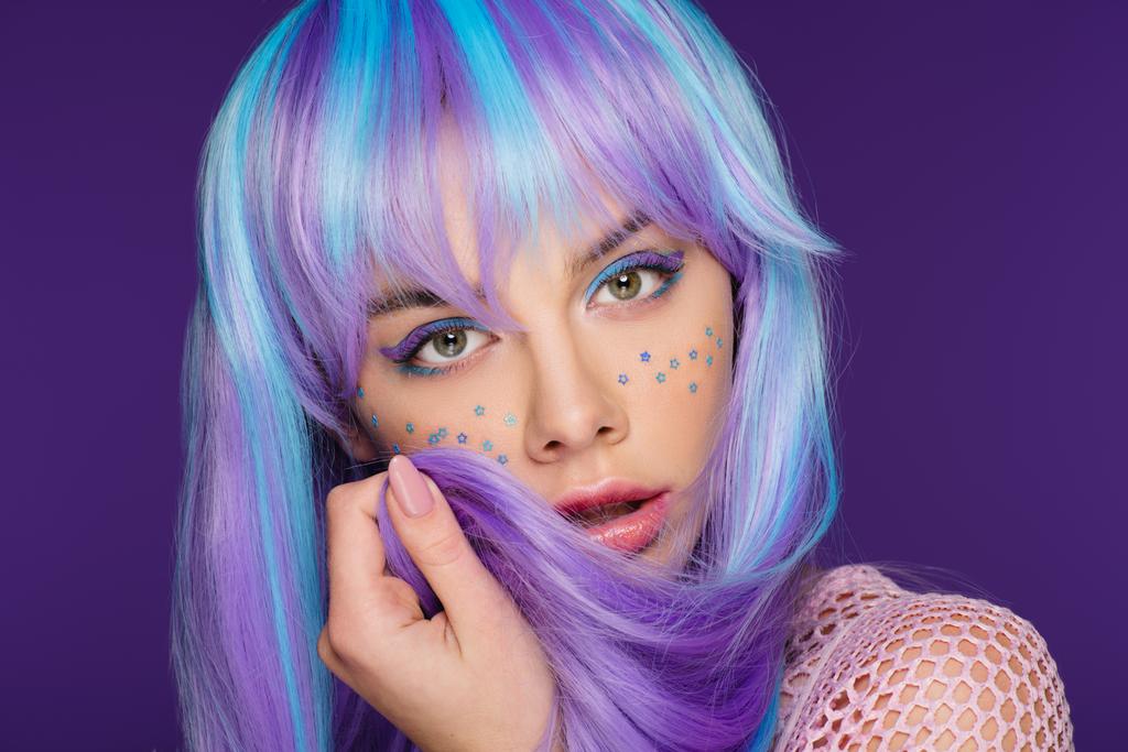
A mix of Very Peri and white creates an aesthetic color combination that can be used in marketing visuals for clothing stores, beauty businesses, etc. Combine Very Peri with light shades of blue or violet to make eye-catching visuals and attract more people to your brand or products.
Stay trendy with Very Peri in your designs.

