The meaning behind dark khaki
About the color
The color name of dark khaki comes from khaki, usually a tan color with a hint of yellow, commonly used for military uniforms and equipment. The khaki shade is known for providing effective camouflage in deserts and other dusty, sandy environments. The word “khaki” is a borrowed word from Urdu meaning “soil-colored.” Khaki has been used as a color since 1848, when it was first introduced for military uniforms. The dark khaki hex code is #BDB76B.
Dark khaki is a darker, slightly more green shade of khaki. The British Army was the first to incorporate khaki as a military color, recognizing that bright colors, such as the red used for military coats (i.e. “redcoats”), was problematic. The first use of khaki for uniforms was in the 1868 Expedition to Abyssinia by Indian troops in Ethiopia. The United States Armed Forces adopted khaki as a uniform color for the Spanish-American War at the end of the 19th century. Today, khaki has extended to smart business casual wear for men. The ubiquitousness of khaki-colored pants in business attire has led to these pants (chinos) being called khakis, regardless of color.
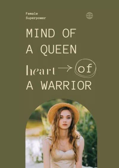
The color meaning of dark khaki comes primarily from the use of khaki for military operations. A project using a dark khaki color code conveys a sense of honor, truth, and military-style discipline. The tan and greenish tones of dark khaki also link the hue with themes of masculinity, regulation, and earthiness. Use dark khaki when striking a tone of quiet strength, calm confidence, neutrality, and objectivity.
| Type | Value |
|---|---|
| HEX | #BDB76B |
| RGB | 189, 183, 107 |
| CMYK | 0, 0.03, 0.43, 0.26 |
Application in design
There are different shades of khaki, especially as identified by the Pantone Institute and color manufacturers. Dark khaki, when written as one word, is a web color and can be used confidently for HTML coding and web design. Take note of the specific hexadecimal code for dark khaki, as it is different from the corresponding codes for khaki, light khaki, and khaki green. Some people associate a color that is closer to olive whenever they think of khaki, so confirm the shade if you’re developing a project for a client.
The complementary hue for dark khaki is a medium blue. A palette based on this combination or pairing is especially appropriate for military institutions, as well as those affiliated with colleges, universities, schools, and sports programs. Dark khaki also pairs well with greens and whites, especially in service of a militaristic or regimented theme. If you’re hoping to communicate “just the facts,” then dark khaki is fitting as both an accent and background tone.
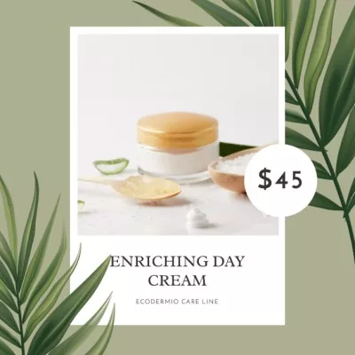
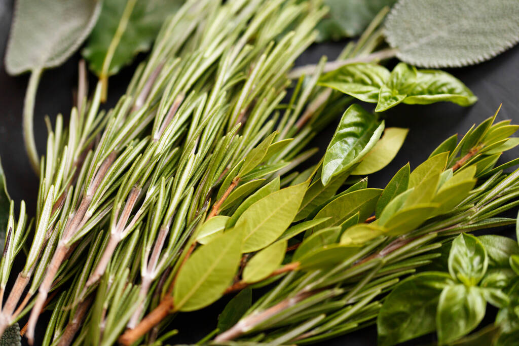
The similarity of dark khaki to olive green makes it an appropriate color for projects related to dining and flavor. Dark khaki can be a neutral color that complements a shade that is brighter and more vivid, such as orange, green, and pink. A color that is too close to dark khaki in brightness and saturation may not work for displaying text and other fine visual elements.