The meaning behind chartreuse
About the color
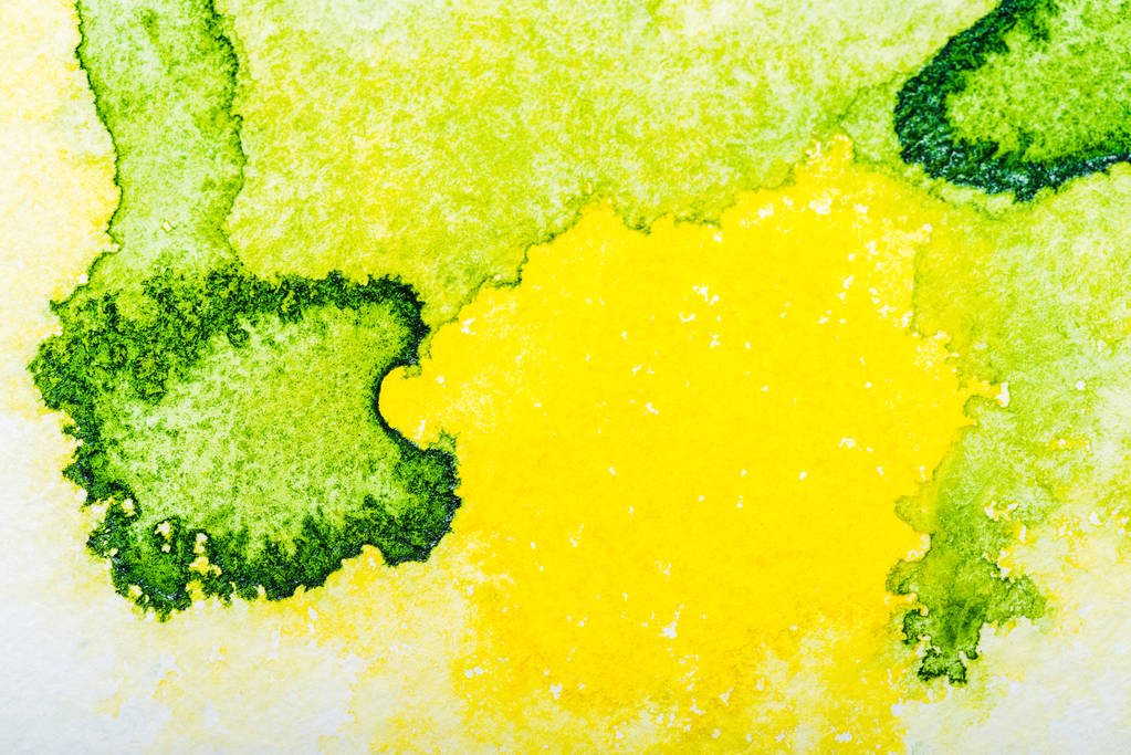
The color with amusing origins, chartreuse, was and still is widely used in fashion, interior, and graphic design. It’s a combination of green and yellow, sitting right between these two on the color wheel. The chartreuse hex code is #DFFF00.
Chartreuse got its color name from a French liquor produced by Carthusian monks. Although monks started making the drink in the 1600s, the color only got its name in the 1800s after being mentioned in a British magazine.
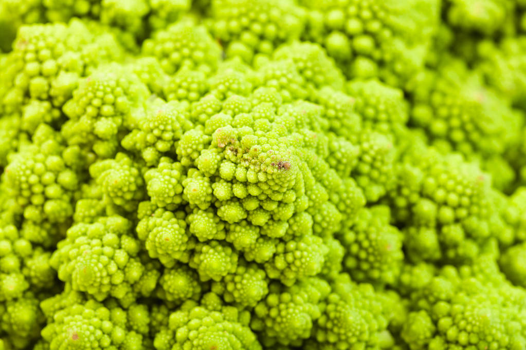
Unlike nature-inspired green, chartreuse is hardly associated with relaxation and vitality. A yellow tint in it makes the color very energetic, optimistic, and even eccentric. Besides, the color meaning behind chartreuse often represents youth and creativity.
A chartreuse color scheme is frequently used for tennis balls, reflective clothing, caution signs, as it’s easy to spot. By the same token, brands include it into their color palettes to grab their audience’s attention, or to make a statement.
| Type | Value |
|---|---|
| HEX | #DFFF00 |
| RGB | 223, 255, 0 |
| CMYK | 0.13, 0, 1, 0 |
Application in design
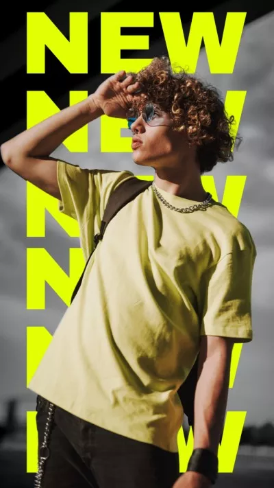
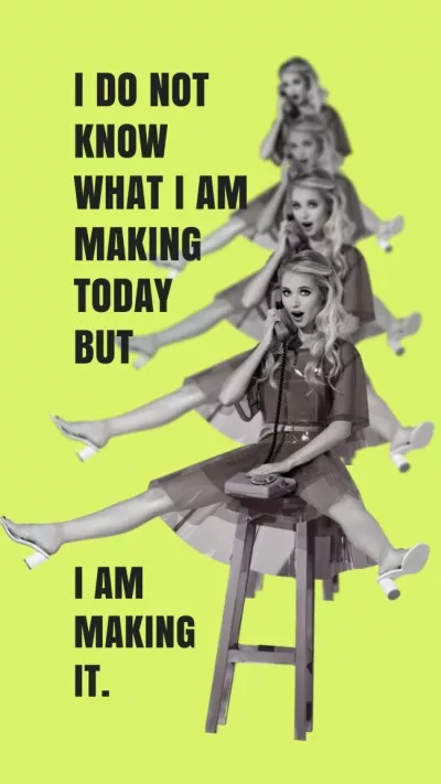
Chartreuse is a color for bold and innovative brands that are not afraid to stand out. It was a hit during the reckless 1920s, and then in the hippie 1970s. So it’s the perfect choice for creating psychedelic aesthetics.
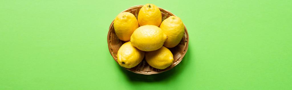
You can combine chartreuse with other vivid hues to express your brand individuality, or use it with muted colors as an accent. For example, combine chartreuse with orange and blue (its complementary color) to make trendy, standout designs. Pair it with different shades of green to create spring-inspired visuals. Or, if you want to create more tranquil content, use it with natural shades, like gray, beige, navy.
Chartreuse is a very saturated tint, so it might not be the best choice for backgrounds. Instead, use it to highlight details in your designs.