10 types of graphs and when to use them
Which type of content are you more likely to click on: a page with images, or something with plain text only?
There’s no question that visuals grab our attention. The human brain actually prefers visual content, processing images up to 60,000 times faster than text. For messages including quantifiable data, using charts and graphs can further help drive your message home.
VistaCreate lets you achieve maximum visual impact with easy-to-use templates, digital creative assets and other tools, and this guide will help you know exactly when to use a graph to make data visualization really count in your content. We’ll explain the different types of graphs, the characteristics of each, and give great examples of how to use them.
Common types of graphs
Charts and graphs can communicate vital information more quickly than text alone. They transform data into visual formats your audience can easily view and understand. The key is to choose an appropriate graph style and use it effectively. Your graphs and charts should tell a story, accomplishing these vital objectives:
- Support your arguments
- Draw attention to important data
- Show relationships between facts and figures
Various types of graphs come in many different shapes and styles. This guide covers the 10 basic charts you’ll commonly encounter in both print and digital media.
1. Bar chart
You’re probably already familiar with the standard horizontal bar charts, which are different from stacked bar charts. These types of data visualizations show individual values as horizontal bars. The y-axis is vertical and represents an item, group or category. Meanwhile, the x-axis represents each group’s numeric value.
Vertical bar charts offer unique advantages. You can see values at a glance and compare them with each other. It’s the best graph for datasets with more than 10 items or long category names.
Tips for making a bar chart
When creating a horizontal bar chart, keep a few things in mind. First, choose a color for all your bars and make them wider than the spaces between bars. Next, use horizontal labels on your chart. Finally, choose a consistent labeling and ordering schema. You can list your bars alphabetically by category or by values from largest to smallest.
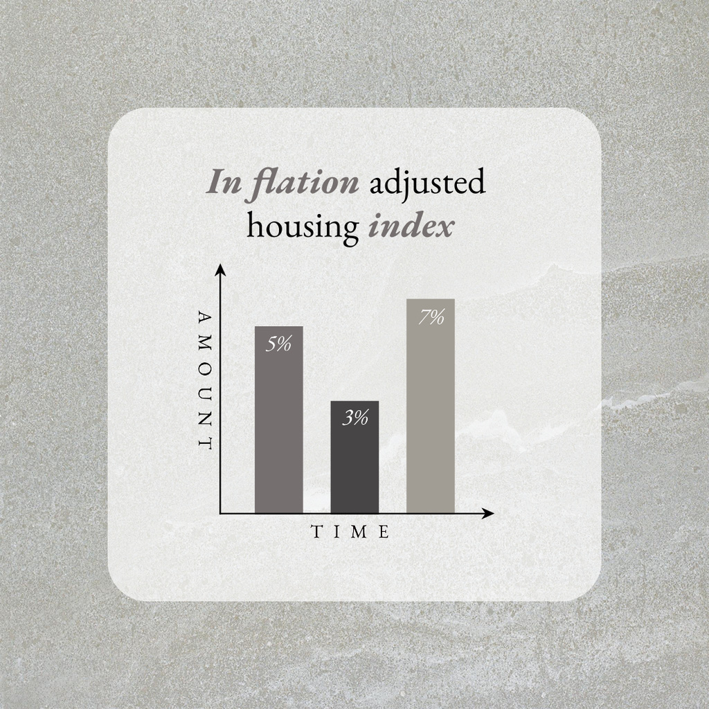
2. Column chart
Column charts are like bar charts except with a vertical orientation instead of a horizontal one. With these types of graphs, each bar can have a different color to help its distinct category and value stand out. They’re ideal for comparing a small set of values.
Think of column charts as snapshots of your data at a particular point in time. These types of graphs can be used to illustrate significant differences between each category’s values.
If you asked survey participants to name their favorite member of a particular K-pop group, your column chart could show responses by gender. You would label your x-axis with each group member, while your y-axis measures responses in numbers.
How to design a column chart
Column charts work best when you have five or fewer pieces of data. For easier-to-read visibility, stick to rectangular bars and steer clear of fancy 3D effects. Also, choose a consistent color scheme and order for your category levels, for example, a different color for each gender or population.
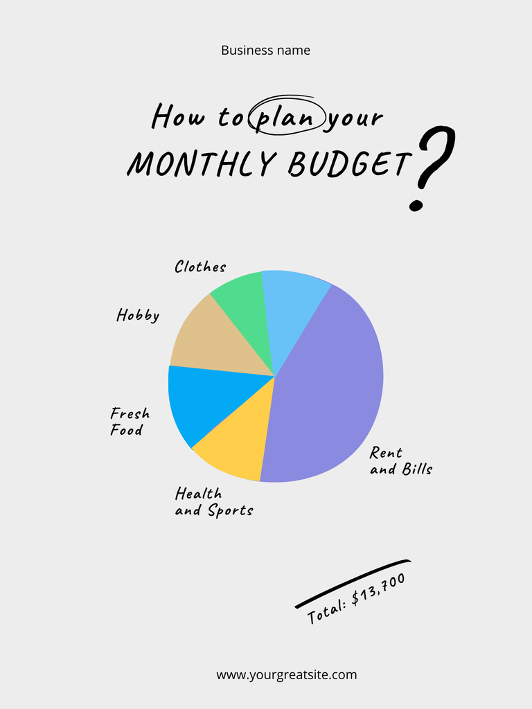
3. Pie charts
One of the most popular forms of graphs, pie charts shows how a dataset’s components comprise the whole. These types of graphs represent data in pie-slice format inside a circle. Each component’s percentage of the whole appears on the chart, but you can also include actual numerical values. They’re best for depicting values from a small dataset.
Pie charts demonstrate how each component’s value relates to the rest of the dataset. Say you survey customer opinions after taste-testing six new ice cream flavors. You could use a pie chart to show each flavor’s popularity — its slice of the pie, if you will. Your survey reveals mango coconut swirl and banana caramel almond as the most popular. If more customers preferred banana caramel almond, its slice would be larger than the one for mango coconut swirl.
Designing pie charts
Pie charts are most impactful when you have a small dataset with only four or five categories. All their values added together should equal 100%.
When creating your chart in an app or software program, label each category with a unique color in the graph options. Make your first slice the category with the highest value and give it a vivid color. The rest of your slices should follow a logical order — clockwise from the next highest value to the lowest, for example.
To add more visual impact, consider using an exploded pie chart. As its name implies, small areas of white space separate each slice from the rest of the pie.
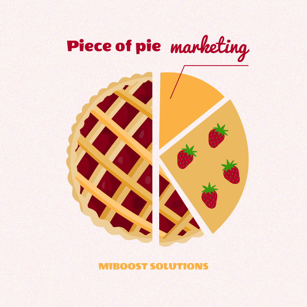
Other pie graph ideas include the donut chart, which has no center, and the multilevel pie chart, a concentric set of charts placed inside each other.
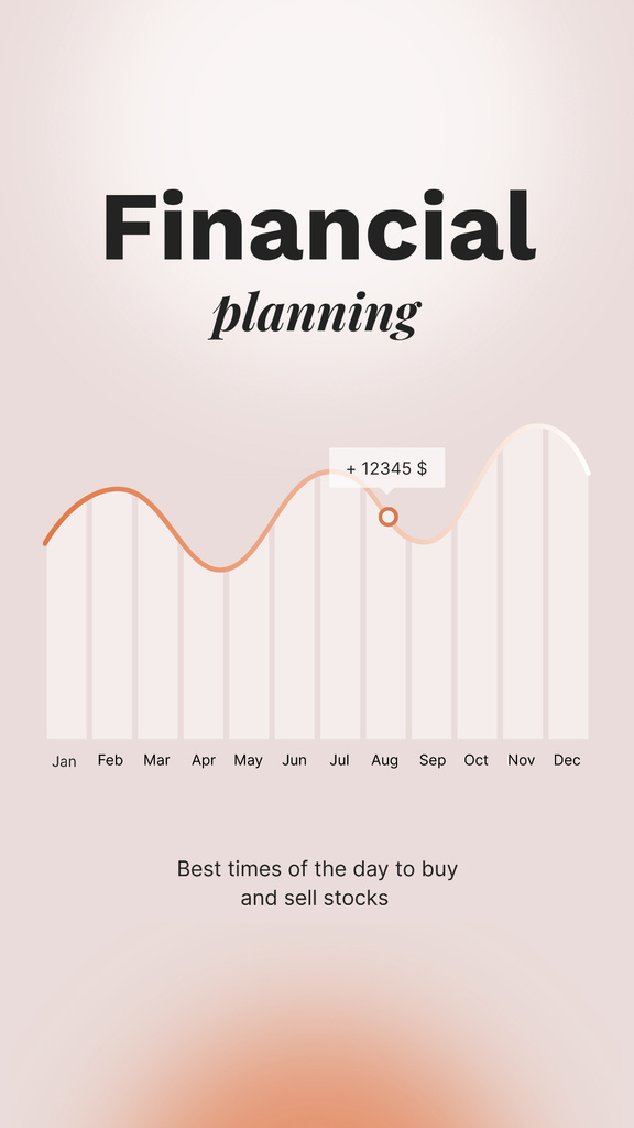
4. Line graphs
Line charts represent changes in an item’s or category’s value. The basic line graph design can help you show increases and decreases over days, weeks, months or years — for example, a company’s stock price during a single year. Line graphs are among the most common statistical types of graphs.
With these types of line graphs, the y-axis represents potential values, while the x-axis represents the passage of time.

This is where line charts do their best work: displaying changes in value over time. If a company’s stock price has risen steadily over several months but suddenly plummets midyear, a line chart can show precisely when it happened.
Tips for successful line graphs
Follow these best practices to create an easy-to-read line chart. First, use solid lines for optimal visibility. Limit your chart to four lines or less to prevent visual clutter. Also, consider directly labeling the lines instead of using a legend. Your viewer’s eyes will stay on what’s important — your data.
5. Area graph
Area graphs are like line charts except they’re filled in with color. Both types of graphs depict changes in values over time. However, area graphs are also visual representations of the volume or quantity of each item. You may have two different types of lines on a graph, but their colored areas will stack on top of each other.
You can use area graphs to show how two statistics compare. This benefit is one reason why the area graph for data visualization is a popular tool. Choose a different color for each statistic to identify it — for instance, red for dogs and blue for cats adopted throughout a single year. If the number of cats was greater, the blue area on your graph will be taller than the red. The blue area will also stack on top of the red.
Helpful tips for your area graph
Area graphs work best when they display four categories or fewer. Be sure to make colored areas translucent to keep any background details visible.
Like with line graphs, it’s best to directly label each area. You can further communicate information by adding explanations and annotations.
6. Pictograph
It’s easy to confuse pictographs with infographics, but there’s one key difference. Also called pictograms, pictographs usually represent one dataset, while infographics often contain multiple datasets to tell a detailed story.
Pictographs represent data using icons or graphics, so they’re easy to read. With their simplicity, pictograms are often used as marketing graphs in digital publications and on social media platforms.
Of the various types of graphs, pictographs are the most useful for showing ratings. They create a memorable visual impact when you want to share a single statistic. Pictographs quickly convey essential information to people short on time or attention span.
Creating your pictograph
Clean designs and simple icons help your pictograph communicate your key points. Use variations of a single shade for your background, text and icons instead of contrasting colors. Keep your pictographs small- or medium-sized — no more than a few vital statistics plus a couple of lines of text.
7. Scatter plot
Scatter plots chart two unique variables to show the relationship between them. Like area graphs and line charts, they have x and y axes. Unlike those two types of graphs, however, the x-axis of a scatter plot doesn’t reflect the progression of time; instead, it’s simply one of the two variables.
Most scatter plots include a trend line to show the variables’ changes in value. If your data shows that income increases with years of education, you could plot the education variable on the x-axis and income on the y-axis.
Creating a scatter plot
Similar to line and area graphs, you can construct scatter plots using a table graph design. To represent your data accurately, begin your y-axis at zero. Try using multiple dot sizes and colors to distinguish each data point from the rest. As with area graphs, annotations on your scatter plot can put your data in its proper context.
8. Gauge chart
Gauge charts show where statistics fall on a spectrum between favorable and unfavorable values. As their name reflects, they look like temperature or fuel gauges. The needle on the chart points at the statistic’s place on the spectrum.
Gauge charts are helpful when a threshold value is already known, illustrating how the given data values compare to the target. These types of graphs show whether key metrics have been met or exceeded. You can also see at a glance if performance does not meet expectations. They can communicate statistics such as sales figures or customer satisfaction ratings.
Tips for designing a gauge chart
Gauge charts are one of the simplest types to create. Your preferred app may include graphs templates that let you plug in the data, choose your options and publish. When designing your chart, stick to only two or three colors for optimum readability.
9. Bubble chart
Bubble charts work like scatter plots except for one key difference: They use uniquely sized and colored bubbles to show relationships between three or more values. In these types of graphs, each unique bubble stands for a specific piece of data. Bubble sizes correlate with number values: The bigger the bubble, the larger the number.
When making a bubble chart, you should first label your x and y axes, for instance, the x-axis as initial investment amounts and the y-axis as return on investments. If your chart displays the performance of four exchange-traded funds, you could use one color for each fund. Label each bubble appropriately — in this case, you could include the name of each ETF and its ROI percentage.
Best practices for bubble charts
Bubble charts’ primary advantage is their use of colors and shapes. You can choose a single color for each data point or use the same color for groups of values. When creating your bubbles, size them appropriately by each data point’s value. Label each bubble with both its category and value.
10. Stacked Venn
You likely know of Venn diagrams, consisting of overlapping circles that show common characteristics between two or more item groups or populations. A stacked Venn modifies this format to illustrate overlapping relationships between multiple datasets.
Stacked Venn diagrams look like concentric circles but with one exception. Instead of orienting around an exact center, all the diagrams inside a stacked Venn originate from the chart’s bottom.
Alternate formats align a stacked Venn’s diagram on its left or right edge. Either way, these data visualization graphs work on the same principle. They’re like nesting dolls: The largest circle represents a total population or dataset, with concentric diagrams showing inclusive categories that comprise it.
Design tips for a stacked Venn
Stacked Venn diagrams are ideal for demonstrating growth or showing relationships between segments of a total population. Labeling each nested diagram is a must, and you also want to steer clear of high-contrast color combinations. Finally, remember that each category diagram in a stacked Venn includes all the ones nested inside.
More pointers for your stacked bar graphs, pie charts and other types of graphs
Charts and graphs must perform certain functions on their own. At the same time, they must also effectively integrate with the rest of your content. For a social media post, one on-point graph can help drive your message home. For longer content, including several charts and graphs throughout the document or presentation can keep the reader engaged.
Storytelling through visuals is the key strength of graphs and charts. Think of them like spice: a little bit goes a long way. Your graphs should amplify and support important points you make in your content. If you’re inserting a graph just to impress your reader or manipulate content to support your point, its use is not effective or ethical.
Your choice of chart style matters when it comes to effectively communicating data visualization. You shouldn’t use a pie chart to demonstrate changes in value over time, nor would you design a gauge chart to depict the percentage each category makes up of a whole dataset.
Besides the logistics and design of each graph style, consider your audience. Maybe they want to understand key points quickly, so a pictograph may be a better choice than a bar, column or pie chart.
Data visualization impacts your marketing materials
We hope you’ve found this guide to various types of graphs helpful. Graphs and charts can add impact to your message, especially when paired with professional-quality visual designs. VistaCreate puts powerful design tools in your hands with intuitive templates plus an extensive digital assets library.
Create a design and amplify your message now.