Design basics: The key principles of visual hierarchy in design
Remember those high school chemistry classes where you learned the basic formulas for various concoctions? Just as any other science, design is also based on certain principles and rules. Designing by intuition merely works and can even hurt — instead, you want to apply universal principles so that every design project of yours is balanced and doesn’t look ‘off’.
This article opens a series of explanatory pieces on design basics. After reading this article, you’ll be able to see what principles can be used to improve your designs, especially if you’re a beginner. Before you get to designing your next piece, let’s talk about visual hierarchy.
What is visual hierarchy in design?
By definition, visual hierarchy is the order in which all elements are arranged in design so that they are prioritized and easily understood by the viewer. Visual hierarchy applies to everything, not just design. There’s a hierarchy in art pieces and a hierarchy in architecture. There’s an information hierarchy in newspapers and a content hierarchy on websites.
To know the basic principles of visual hierarchy means to have the key to designing effective and balanced visual pieces. The visual hierarchy shows what’s most important in your visual, and helps guide the eye to secondary information. Its principles apply everywhere — from business cards to packaging, social media, and web design.
Why is visual hierarchy important in design?
Visual hierarchy is essentially your guide to designing a piece that will be well-received by your audience. When you apply its principles — that is, key aspects of composition, typography, color, and others that we will discuss below — you can be sure that your visual transmits your central idea to its viewers. On the contrary, when you neglect visual hierarchy basics, your designs just don’t look right.
Basic principles of visual hierarchy every designer should know
One of the most important terms to know when it comes to visual hierarchy is the focal point. It’s the most important part of your visual, a place where you want to direct the viewer’s attention. This could be your call-to-action phrase, website, or logo.
Before we set out the most important design principles, let’s find out how humans process visual information.
How the human eye processes information
People naturally start reading texts from the top of the page. In most cultures, people read in the direction from left to right. This, in turn, affects how people process other information — design pieces included. According to eye-tracking systems, we now know of the two most popular ways people process information is in F and Z patterns.
F pattern
F pattern says people begin processing information in the upper left corner, then go right, down a little, go right, and go back down again. That’s why in many designs the most important information is placed in the upper left corner — that is applicable to logos or namings, for instance.
Z pattern
Z pattern is most common for website design. Here, people first look at the top left corner, where the logos are usually placed. They then scan the page from left to right, where the menu bar is. Next, the human eye follows the right-left diagonal and continues to the right.
Here are how the two patterns work:
Knowing these two patterns will help you place the most important objects accordingly. Now, let’s review nine key principles of visual hierarchy in design.
9 principles of visual hierarchy
1. Odds and thirds. The basic principles of composition
Composition is what stands behind every great artwork. Leonardo Da Vinci, Claude Monet, and Kazimir Malevich all relied on the basic principles of composition in their works. These principles give your design proper structure so that every element has its designated space. Let’s talk about some of them — the rule of odds and the rule of thirds.
The rule of odds
The rule of odds says it’s best to have an odd number of elements in your design. Here, one element can be your focal point, while others serve as complementary elements. Take a look at this example that presents an odd number of elements.
The rule of thirds
Next time you’re designing, try to put an imaginary (or real) grid on your visual. This way, you divide your visual into nine equal squares and arrange elements where they naturally fit best. Your focal point is most likely to catch your audience’s attention when placed on points where lines of the grid intersect. Ideally, you want to place your most important parts on all nine intersection points. A good exercise here can be this: when viewing designs, note what catches your attention first. Most likely, these will be the objects placed on grid intersections.
2. Where to look first? Typography in visual hierarchy
Typography is an essential part of any (or almost any) good design. Sometimes, you simply place one word on your visual and it becomes a focal point. More often, you need to have a number of lines in your design. Here, typography or information hierarchy principles will come in handy.
According to typography hierarchy principles, people process typography based on three main groups the text is arranged into. The first one is the most important typography part of your design — that’s where your viewer gets all the key information you want to transmit. In newspapers, it’s usually the headings. Next, there’s the second level, which deals with subheadings that are aimed to direct the reader’s attention. The third one usually gives the reader details on your design.
Learn more about typography and how it’s used in designs in the best blogs about design.
3. Bold, italic, serif. How to work with fonts
Now that we know of typographic hierarchy, let’s find out the key principles of working with fonts. Here, you need to recall the basic features of fonts — styles and categories. So, fonts can be:
- Bold, italic, all capital letters, and more
- Serif, sans-serif, script, or decorative
With these styles and categories in mind, it’s important that you choose them wisely for your design project. Use styles and categories adhering to the principle of balance. For instance, you can choose bold, italic and capital letters fonts, with some of them used to accentuate your focal point. As with colors, you want to use fonts according to your Brand Kit, so they correspond with your company’s style.
As in this example by UI.Global, you can choose capital letters for your heading, and opt for a regular style font for the rest of your text.
Another example uses the decorative font to drive the viewer’s attention. Note how in this hierarchy, photography is a focal point.
☝🏻Check out what we previously advised on using fonts:
4. Color and contrast. How to choose proper colors
Color hierarchy is important, too. In fact, colors can evoke certain emotions in viewers and set specific moods. That’s why many brands pour huge sums of money into distilling their distinctive colors. But how exactly does color hierarchy work in design?
Bright colors, such as red, green, or yellow instantly attract attention. That’s why you want to use them to emphasize what’s focal in your visual. Use bright colors for buttons, headlines, call-to-action phrases, or key objects. Dim colors, on the other hand, are less noticeable and could be used for lesser important objects in your design. The contrast between these colors is the emphasis used to create hierarchy.
To set a color hierarchy that attracts attention, there are some important components you want to use:
- Color temperature. Yellow, red, and orange are considered warm, while green and blue are cold colors. For effective design, it’s best you use both cold and warm colors in your palette. Remember the neutral colors — black and white are powerful tools, too.
- Color saturation. Remember how you design and give one color 100% saturation in your design instrument settings? This means it is used in its natural form, its brightest color. For better readability of your visual, you want to combine colors with high and low saturation.
Let’s see how colors are used in the examples below:
☝🏻Check out our previous articles on color usage in design:
- Put color theory into design practice
- Best colors to use on each social media: Hues to your business (ad)vantage
- Very Peri — the Pantone color of 2022 and how your business can use it
- 7 colors that will influence brand growth
5. How to emphasize with sizes and scales
With sizes, everything is quite simple. You want to make objects or texts bigger to give them more significance and make less important objects smaller. So, in graphic design, you have to prioritize objects and text size wisely and decide which one is most important.
For instance, in advertising, it’s common to make call-to-action blocks bigger, so that they are easily noticed by the audience. The size principle applies everywhere, even in this article. Note how the article name is given the biggest size, while the subheadings are smaller — that’s to accentuate the importance of heading first.
Let’s see how this principle works in the examples below:
6. White space as an innate part of your design
When you’re designing, you probably want to include as much information as possible in your visual. However, for most designs, it pays to have plenty of white, or blank space. Why is that? The thing is, no matter how great your design is, you want to give your viewers a place to rest their eyes. In fact, white space is essential in every design project. It often helps emphasize your focal point, that’s why designers resort to it so often.
To make your design effective, you have to prioritize your information and know very clearly what to neglect.
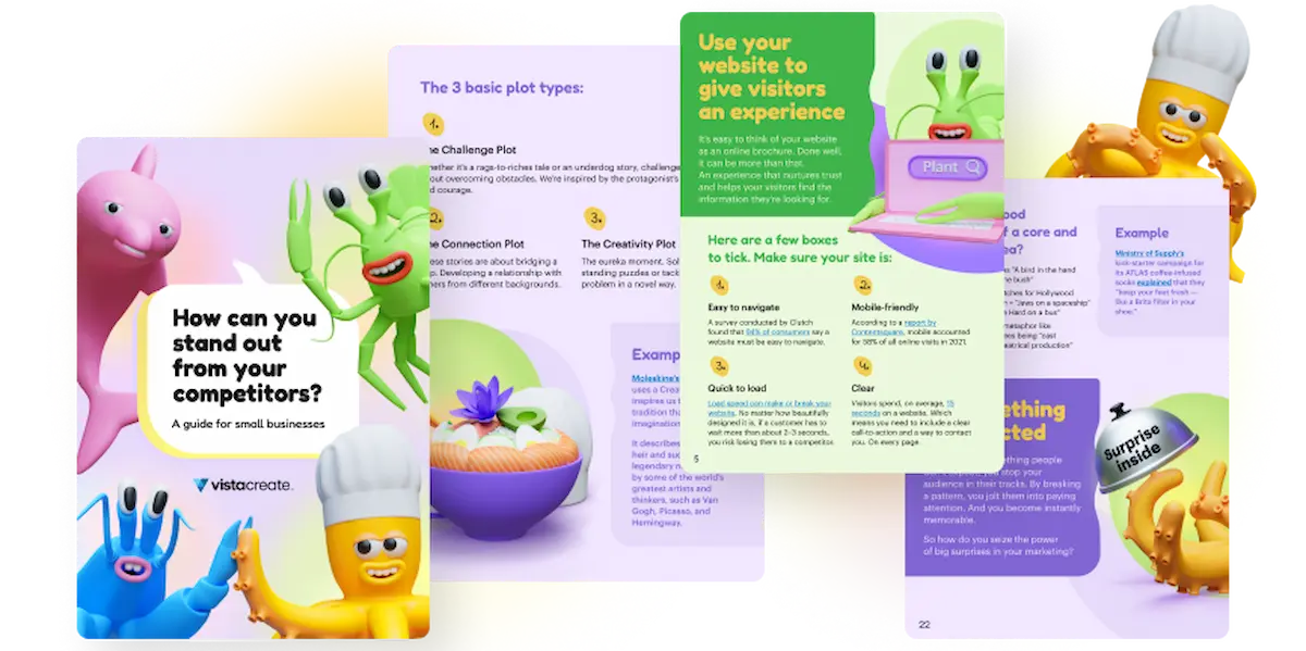
Take a look at these visuals making extensive use of white space to drive attention to one word.
7. Add movement and direction
Even if your design is initially static, you can give it some movement so that it’s more appealing to the viewer. Lines, arrows, and Z-shaped forms in design can help direct the viewer’s attention where you need — to your focal point. You can build your whole design around these movement objects, or add them at the end of designing.
Use the movement and direction objects in moderation. Again, it helps to decide on what your focal point is at the very start of designing your piece — and try to make it easily noticeable for the viewer.
8. Guide your viewer with alignment
As you’re reading this text, the sentences are aligned left. This helps with focus and arranges visual flow according to the Z and F patterns that we previously talked about. In design, it’s best that you try to align your elements in a certain way, rather than have them chaotically placed all over the visual. With alignment, you establish a proper visual flow in your design project, so that the objects of the same importance are grouped together.
See how “W” aligns with the picture of a wolf in the design below, and how texts align to the left in the second visual.
9. Break the rules
They say there is no rule without an exception. Though these basic principles are essential to know, sometimes it pays to neglect them. Experienced designers often craft their pieces relying primarily on their gut feeling. This way, designs can appear to be rather unexpected, yet unique. Here, it’s important that you learn the basic principles well before going with your mere intuition to create designs.
Note the examples below to illustrate this principle.
You can also drive inspiration from our list of 15 must-follow designers on Instagram to see how they create outstanding projects. Alternatively, you can check out our articles on current trends in design to see what’s hot and what’s not. Make sure you start off by subscribing to the VistaCreate blog, of course. 👀
Key takeaways
Visual hierarchy is your go-to guide when it comes to starting your next design project. Like every science, design relies on the basic principles that help make designs effective, catchy, and eye-pleasing. Below, let’s recap some of the essential principles you want to use in your designs:
- In every design, you should identify your focal point, or the most important part of your visual, and drive viewer attention there
- People process information by F and Z patterns
- The basic principles of composition are the rule of odds and the rule of thirds
- You want to use fonts of different styles in moderation
- Choose contrasting colors to instantly draw attention
- Accentuate the most important parts of your design with scale and size
- Make room for ample white space
- Create movement in your static design
- Guide your viewer with alignment
- Once you’re more experienced — try breaking the rules and going with your gut feeling to create the next great design
Be it your next outdoor poster, Instagram publication, or Twitter background — these rules apply everywhere.
Make this article your new hovering tab and get your next design ready!