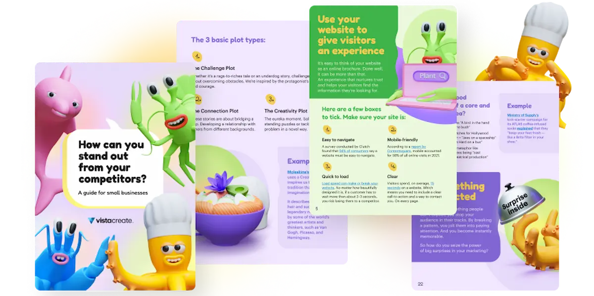
The 2023 guide to building a brand kit that works
“Your brand is what other people say about you when you’re not in the room.”
It’s a quote that always rears its head whenever brands are mentioned, but ol’ Jeff Bezos is probably someone you should listen to when he talks about branding — and we can confirm that he’s definitely not wrong on this count.
Creating your own brand is no easy task.
Especially if you want to build a brand that makes you stand out from the crowd. And especially if you want to build a brand that is instantly recognizable. And especially if you want to build a lovable brand that fosters trust and resonates with your audience. And esp… okay sorry we’ll stop now.
But the point still stands: Brands matter. And because brands matter, that means brand kits matter too.
Pop quiz: What’s one of the most valuable things to a small business owner?
Did you say time?
If you did, we definitely agree. And as they say, time is money – and ipso facto, brand kits will save you a whole lot of both.
Read on as we take you through everything you’ll need to make a brand kit that’ll knock your competitors’ socks off, and take you through the value you can gain from having a top-notch brand kit.
What is a brand?
Before we dive into brand kits, let’s first make sure we all know what exactly a brand is.
To do this, we’re going to take a look at another quote — this time from marketing and leadership guru Seth Godin — that sums it up quite nicely:
A brand is the set of expectations, memories, stories, and relationships that, taken together, account for a consumer’s decision to choose one product or service over another.
We think this quote sums it all up pretty perfectly, because think about it — expectations, memories, stories, relationships — these are all intangible things that can’t be forced, coerced, or faked. A brand is either genuine or it isn’t. It either works or it doesn’t. Customers will either choose you or they won’t.
And it’s not just businesses that use brands; people have personal brands as well.
So whether you’re a small business, a big corporation, or just a person, your brand is used to give you a name, a face, a way of communicating, and a persona that is instantly recognizable and attributable to you.
Essentially, a brand is who you are.
What is a brand kit?
A brand kit is the “how to” guide on how to brand your business.
A brand kit can help to provide any relevant party with all of the relevant tools, information, and science on how to be consistent with your brand marketing.
Basically, it’s a short, easily digestible bible of what makes you, you.
And when it comes to branding, consistency is key. No matter who is creating your content, it should always sound, look, and feel as if it has come from the same source — because if your brand has a different tone of voice, for example, each time a piece of content is shared people won’t know what to expect and that fragile bond of trust that took so long to build can be damaged.
Plus, once a brand kit has been created, it will save you a lot of time. And honestly, we mean a lot of time. It helps prevent you from having to make a huge number of micro-decisions each and every time you approach a new graphic project for your business, and can significantly cut down briefing time for freelancers.
That’s why brand kits are such an important tool to have.
What design elements should a brand kit include?
DISCLAIMER: Before we get started, we want to make one thing clear.
Creating a brand kit isn’t as daunting as it sounds. We promise.
You’re basically setting up your own set of rules of how you want to be portrayed so that your business can be better recognized. Those rules can be as complex or as simple as you like, it’s all up to you!
So don’t fret. You’ve got this.
As we mentioned earlier, design is a vital part of creating a brand, and a brand identity kit can be used to keep your design consistent in all areas of your business.
Your brand kit should reflect the values of your business and go some way toward saving you a big chunk of time when you’re either creating new designs in the future, onboarding outside design help, or giving new hires the lowdown.
You don’t want to overwhelm the reader with pages upon pages of information so deep and detailed that nobody wants to even attempt to read it. Instead, you want a short, snappy, but informative guide that lays out your design standards.
But it’s important to remember that your kit shouldn’t be treated as a set of hard and fast rules, but instead as a way to provide the reader with a framework that they can work with and be creative within.
So what should you include in your brand kit? And why is making a brand kit so important for designers and small business owners? Let’s take a look.
The “big three”
Fonts
Fonts aren’t exactly the first thing you’ll probably want to consider when designing your brand. But the design of the words that you use to communicate to your audience can actually play a big role in the way that you’re perceived and recognized.
Some brands will create their own fonts (helping them dodge licensing fees), but it’s perfectly acceptable to use one of the preexisting modern fonts if you feel it fits with your brand.
Learn more about the basic principles of typography in this video:
Using a single font theme across all of your copy, designs, and content helps to give you a strong level of consistency. You’ll want your brand kit to include:
- What fonts your brand uses
- Whether you use a different font for your headers compared to your body text
- The size, weight, and orientation of your fonts
When choosing your font, know that your choice can say a lot about your brand strategy, its focus, and its values.
For example, a straight, bold, strong font will instantly portray professionalism, and give your brand a rigid feel. Perfect for a law office, but it might not be the choice for a children’s daycare center.
Whereas a curvy, scruffy font that looks almost handwritten is a great choice for a freelance writer but perhaps not the best fit for an accountant.
The best advice for choosing a brand font for your business is to keep it simple. Realistically you shouldn’t be using more than two different fonts — one for the headings and one for the body text — and these two should always complement each other.
Colors
Choosing a color palette can be a relatively nuanced decision. You’re not just choosing a color at random or your favorite color as a kid, it has to be a color that represents who you are, what you offer, and the feeling that you want to put across to your audience.
You’re running a relaxing spa? Perhaps a nice cool blue will do the trick. You’re opening a health foods store? A peaceful, natural green might be the choice for you. You’re building a brand that wants to portray itself as strong and balanced? Maybe go for a solid mix of black and white.
➡️ Learn more about the connotations behind different colors in our article about the 7 colors that will influence your brand growth.
Some brands can even become almost synonymous with a particular color. For example, what is Coca-Cola without the instantly recognizable bright-red color scheme? We’ll tell you what it is: strange.
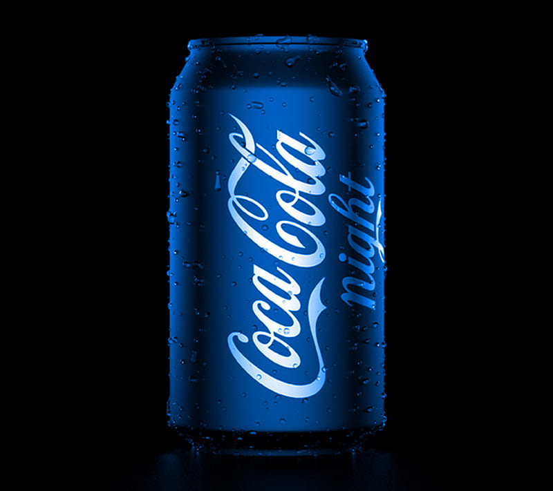
Doesn’t this just feel a bit…off?
Sure it might look like a sleek, clean design, but it just isn’t the Coca-Cola we all know and love. This just highlights the importance of color in a brand, as it’s these changes or inconsistencies that can so easily throw an audience off.
A brand kit that has a strong color palette can work wonders for your business. If your branding is pleasing to the eye or pleasingly eye-catching, then your engagement can see a big boost.
After all, nothing is worse than looking at a product with clashing colors. Yuck.
Dip into the basics of color theory in this video:
Logo
When you think of a brand, unlike the font, a logo is probably one of the first things that springs to mind. And the reason for this is simple: It’s the first thing you see, and it’s the thing you’ll probably see most often.
It’s basically the face of your business, so you need to make sure it’s a good face to see.
In fact, some logos are so prominent and inextricably linked with their brands that you don’t even need to see the full picture to recognize them. For example, if you were to see the following three symbols, we’re willing to bet you could figure out which famous logos and brands we’re talking about:
- m
- ✔️
- 🍎
If you said McDonald’s, Nike, and Apple (okay that one was easy), then congratulations — you’ve shown just how powerful imagery and logos can be.
Logos can play a big part in the success of small businesses. People love branding, and a good logo never goes unnoticed, nor does it go out of style. So if you can create something that resonates with your audience, you’re 100% on the right track.
When creating your logo, you’ll want a design that is identifiable and unique, and which can be immediately linked to your brand. But you also don’t want to overdo it. Most of the more successful name-brand logos tend to be pretty simple, so if you find yourself throwing in more detail, color, and shapes than you know what to do with, maybe consider scaling it back a touch.
But on the subject of shapes, almost everything down to the shapes and lines of your logo can be important when it comes to the psychology of your audience.
For example,
Square shapes: Square logos tend to be used to convey strength, professionalism, practicality, and efficiency.
Circular shapes: Using circles in your logo indicates stability, community, unity, and friendliness.
Triangular shapes: Triangular logos are often used to convey power, stability, reliability, and knowledge.

Horizontal lines: By making use of horizontal lines in your logo, you can associate attributes such as speed, tranquility, and calmness with your brand.
Vertical lines: Strength, aggression, masculinity, and progress are often associated with designs that incorporate vertical lines.
Creating a logo can be tough to do on your own, but hiring outside help for a logo design can be an extremely costly venture, so why not let us help you? Using our logo maker, you can create a unique logo with ease — and no design experience is needed.
Once your fonts, colors, and logos have been decided on, you basically have the rock-solid foundation on which you can build the rest of your brand kit. So if you’re happy with what you have, then it’s off to the races – as everything else can be built up naturally over time.
The “just as important but also not quite” three
Once your big three are set in stone, you can start to work on the next three aspects of a brand kit. As we mentioned, these don’t have to be quite as rigid and can be built up over time.
That gives you the opportunity to make your decisions based on what you think might work well alongside your foundation, as well as test a few ideas out before making a decision.
Textures
Wait, textures? As in what your brand feels like?
Not quite.
For small business owners, textures are a great way to add an extra element of depth and elevate your branding. They’re almost like the wallpaper of your brand.
In fact, visual texture can have quite an effect on people, sometimes without them even noticing, and it can play a big role in brand recognition for businesses big and small.
Textures are a versatile tool that offers a different set of benefits and options — ones that more traditional branding methods or elements can’t quite provide. A design that has an almost visceral feel to it can bring up a number of emotions and can even link to memories.
Textures tend to be used in online content. Whether that’s in the background of an advert or perhaps on a particular page on your website. But brands can utilize textures in a number of different ways; it’s all down to preference.

Sound (music/jingle/sound effects)
We’ve all had a catchy jingle that simply won’t let our brains go, or a ringtone that’s more of an earworm than an alert, or a particular sound that instantly puts an image in our heads.
For example, let’s take the classic 1991 advert for the cosmetics company Maybelline. If you were to hear “Maybe she’s born with it”, chances are you’ll fire back with “Maybe it’s Maybelline”, right?
Or that instantly recognizable sound when Windows XP starts up.
Or this little tune sung by a giant that straight away makes you think of a lovely can of sweetcorn.
Simply put, some brands just absolutely nail it when it comes to brand sound recognition.
However, not every brand will make use of sound. Having a successful sound associated with your brand is an extremely difficult thing to achieve, and it requires a particular skill set that not every small business owner will have access to.
But if you manage to achieve it, you’ll be able to add a powerful tool to your brand kit arsenal.
Tone of voice
If your brand was a person, their tone of voice would be how they speak and communicate with the outside world.
Tone of voice may not exactly fall under the banner of design, but it is one of the most important aspects that the company branding process should consider. Your tone of voice dictates how your brand will communicate and connect with your audience, and it’s a way to display your values and your ethics, and differentiate yourself from your competitors.
Your tone of voice will be seen across all your forms of content. Whether that’s your adverts, your website, your blog posts, or even your social media posts.
When considering your tone of voice, it’s important to always relate it back to your audience. What will they want to hear? And what is the voice they want to hear it in?
Take UK-based fast-fashion retailer PrettyLittleThing:
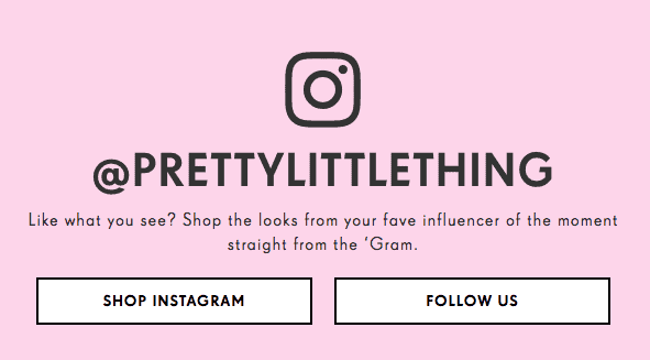
Their audience is predominantly women aged between 16 and 24, and they know that a large section of the demographic that shops with them has an interest in fashion influencers and consumes a lot of their content from Instagram — so their tone of voice is heavily influenced by this.
Now let’s take a look at the exact polar opposite in whiskey manufacturer Jack Daniels:

Their tone of voice is more formal and grounded, and you can really picture and hear the person saying the words. You can almost see the plaid shirt and hear the gruff Southern drawl as this advert disparages the modern culture of using filters on photos, stating that the only filter Jack Daniels uses is charcoal.
You can see from these two examples that it doesn’t matter what you choose for your tone of voice, as long as it sits with your brand and your audience. Both of these styles work, but can you imagine PrettyLittleThing’s tone of voice for Jack Daniels? Or Jack Daniels’s tone of voice for PrettyLittleThing?
It just wouldn’t work.
And the same goes for you – your tone needs to align with your business. If it doesn’t you’ll only be sending out a confusing message to your audience that will most likely alienate them from your brand.
Bringing it back to design, you can also see in both of these examples how nicely the tone of voice sits with the design. They complement each other and make it instantly clear to the reader what the brand is all about.
Okay, I’ve got my brand kit — what next?
Now that you’ve got everything you need to put together an effective brand kit, it’s time to use it.
And we know that we’ve said it before, but it’s worth saying it again: Consistency is key. Consistency, consistency, consistency, consistency. One more time for those in the back:
CONSISTENCY.
With your shiny new brand kit to hand, you should now apply your branding across your whole business from front to back. Every single little thing that comes out of your business should be in line with your brand kit, and should tell the story of who you are and what you stand for.
And the next time you hire a freelancer, guess what will be straight in their inbox? Your brand kit. Your next in-house hire’s first gift? Your brand kit. Need a Christmas gift for your entire family? Your brand kit.
This kit is now the gospel truth on how your brand looks, feels, and acts.
But does it stop there?
It sure doesn’t.
Your brand will constantly evolve, just like your business does. You’ll discover new things that you value, new audiences to reach, and you’ll always be growing, shifting, and changing throughout the years.
But you’ll be ready for these changes, with your trusty brand kit ready by your side.
And do you know who else will be by your side? Us of course! VistaCreate takes the stress out of design with our brand kit builder, which allows you to design every aspect of your brand kit with your own colors, your name and logo, and your fonts.
If you haven’t built your brand kit yet, then VistaCreate will be your savior. It is extremely flexible, and provides you with a wide range of dazzling design templates.
And when you have built your brand kit? VistaCreate’s value goes off the charts. Now every template you create becomes a template that’s perfectly suited to your business with your own colors, fonts, and the logo from your brand kit.
So don’t just make it, VistaCreate it.