Graphic Design Fails: 50 examples of design mistakes
Disclaimer: This article on graphic design mistakes was originally written in 2018. Much has changed since then! Let these bad design examples take yo...
Home > Design > Graphic Design Fails: 50 examples of design mistakes
Home > Design > Graphic Design Fails: 50 examples of design mistakes
Disclaimer: This article on graphic design mistakes was originally written in 2018. Much has changed since then! Let these bad design examples take you on a journey down memory lane of totally different aesthetics and (hopefully) poor design choices that you’ll find funny.Yes, facepalming will be an integral part of this article about graphic design fails, poor design choices, and generally bad bad design examples. Put your coffee aside, because the giggles you’re about to experience are as real as the astonishing reality of some of these designs.
Keep in mind that having a designer on your team is very valuable. Some of these designs remind us that it’s equally important to at least follow some basic design tips, maybe have a proofreader look over your work, oh and never disregard your audience. Avoid design mistakes at all costs.
The collection of design fails or just terrible design includes product design, packaging, awful copy, store signs and pamphlets made with no after thought, and just brilliant t-shirt designs that people probably wear with pride.
Without further ado, we’d like to introduce you to some of the biggest design fails so that you’ll know what to do, what you definitely shouldn’t do, and just how important design is in everyday life.
If you’re feeling confident about designing something of your own, hop on over to VistaCreate and enjoy our super easy to use editor for outstanding designs for socials, web, and print.
Top 50 graphic design fails you need to see
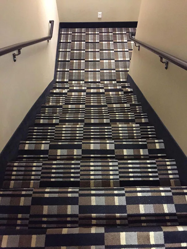
1. Nice pattern, but I’d rather take the elevator
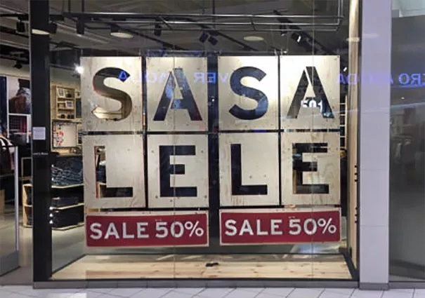
2. I live for sa sa le les
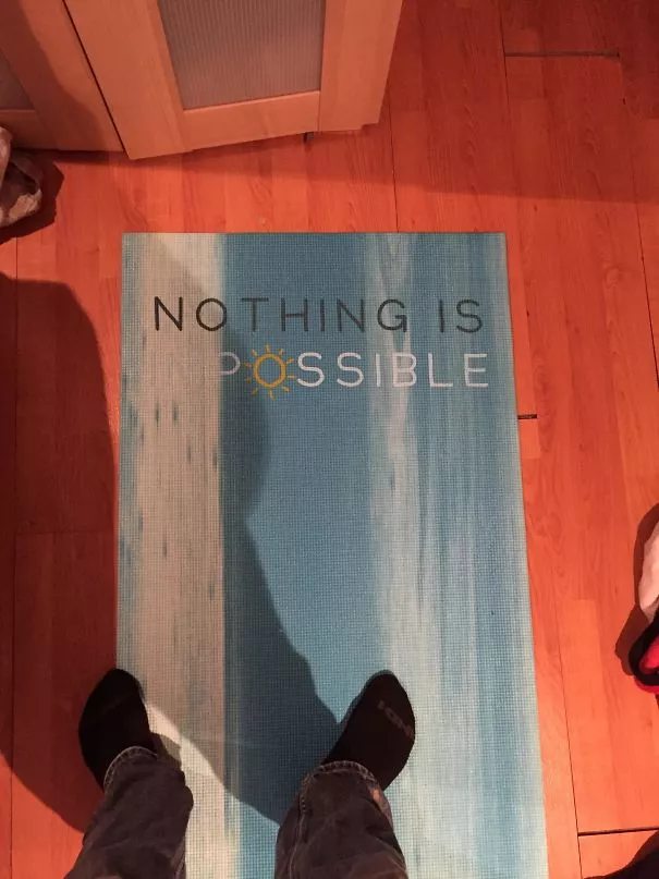
3. That’s really motivating, thanks
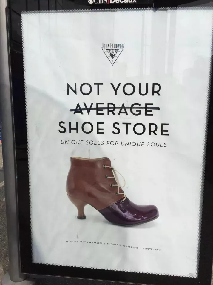
4. Sooo you’d like me to be a customer or not?
25. A great example of how color choices matter
26. I just lost my appetite…
27. The legend is spot on
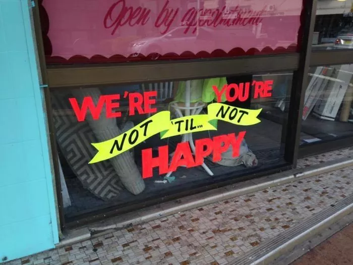
28. Nice try though!
29. Objective: confuse consumers to buy stuff anyway
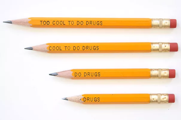
30. A designer’s kerning nightmare
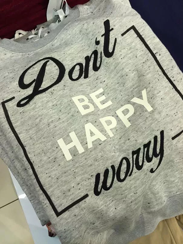
31. Not sure if awful font, or awful quote
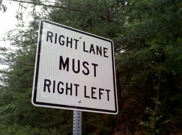
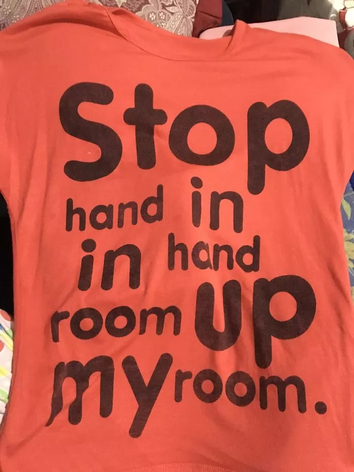
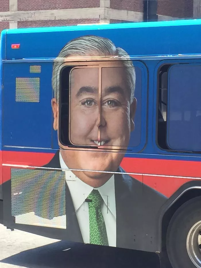
32. Must right left
33. The importance of visual hierarchy
34. When you put in 0 effort
35. Someone thought the watermark was pretty
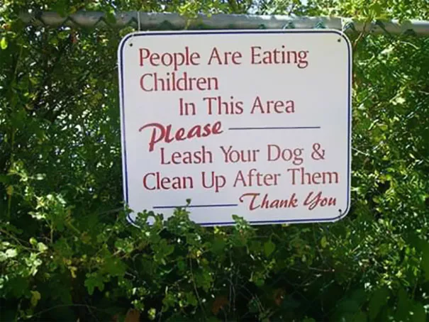
36. That’s disgusting.
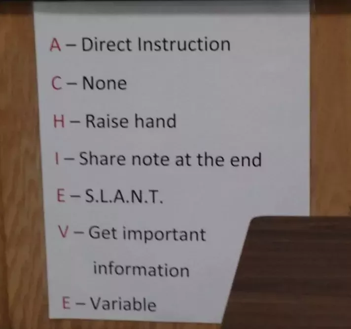
37. I’m sorry, what?
38. That’s not how venn diagrams work, but okay
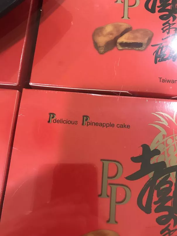
39. I want some pdelicious pineapple cake
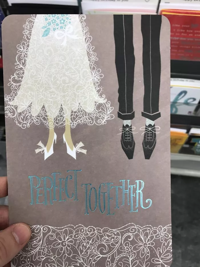
40. They might be perfect, but…
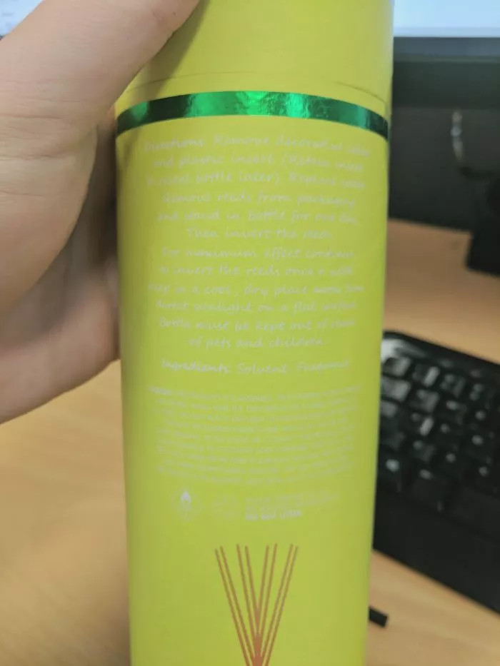
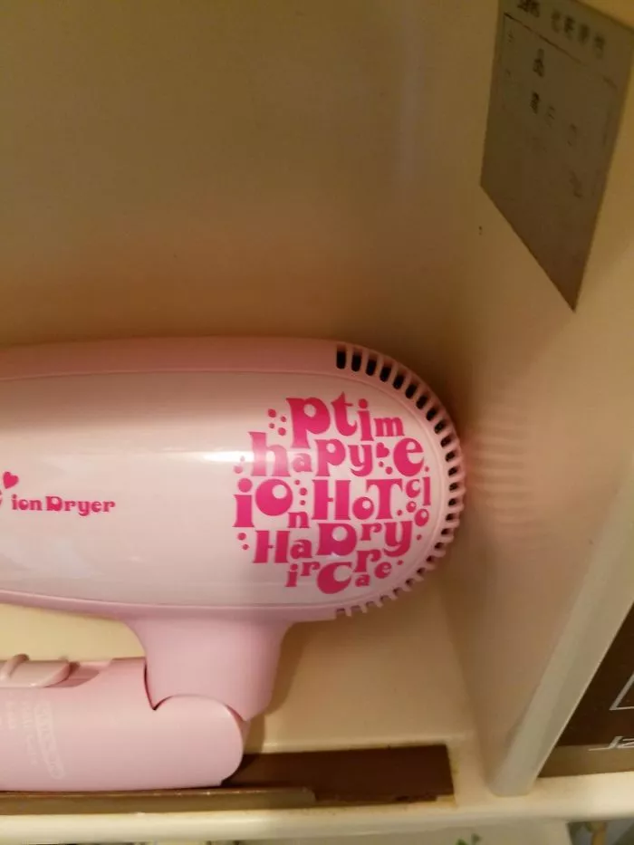
41. Hmm…happy time ion hot hair dry care?
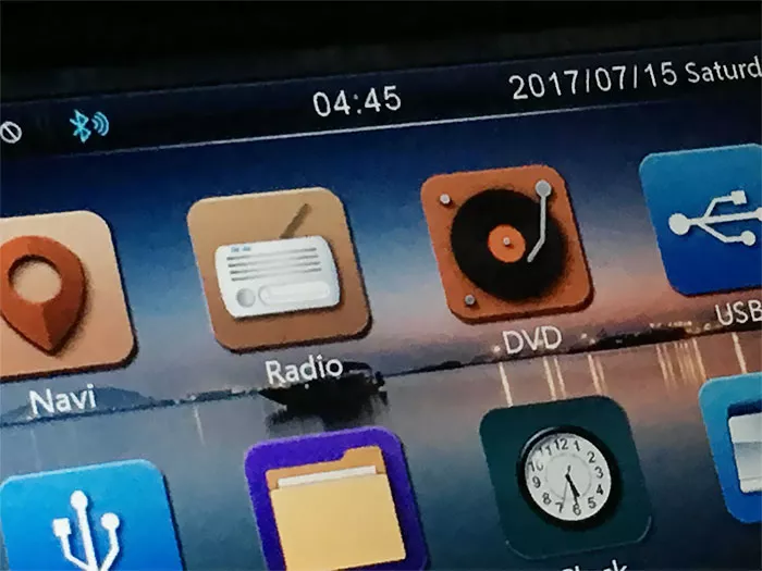
42. Very innovative DVD
43. A failed hashtag
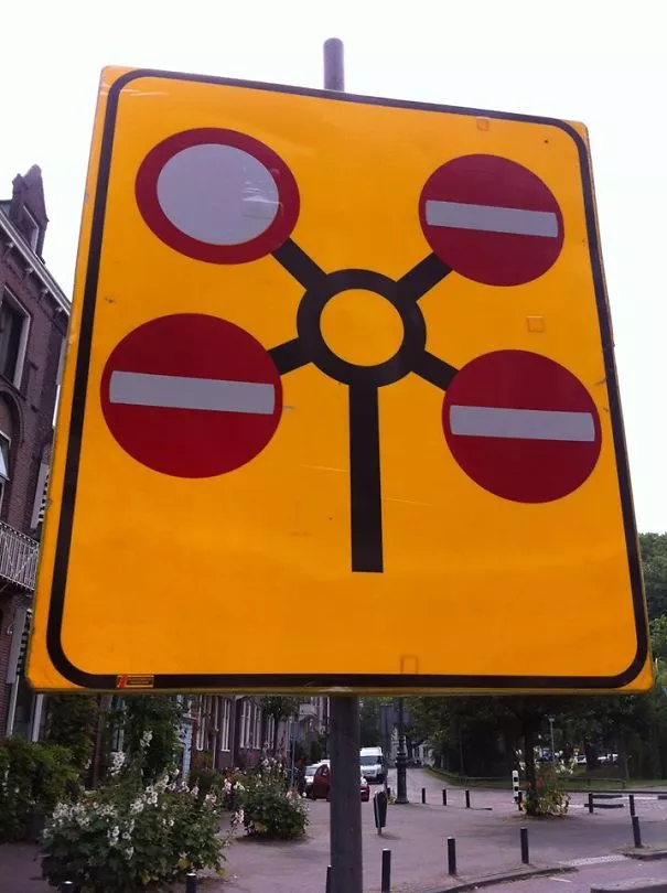
44. The road to nowhere
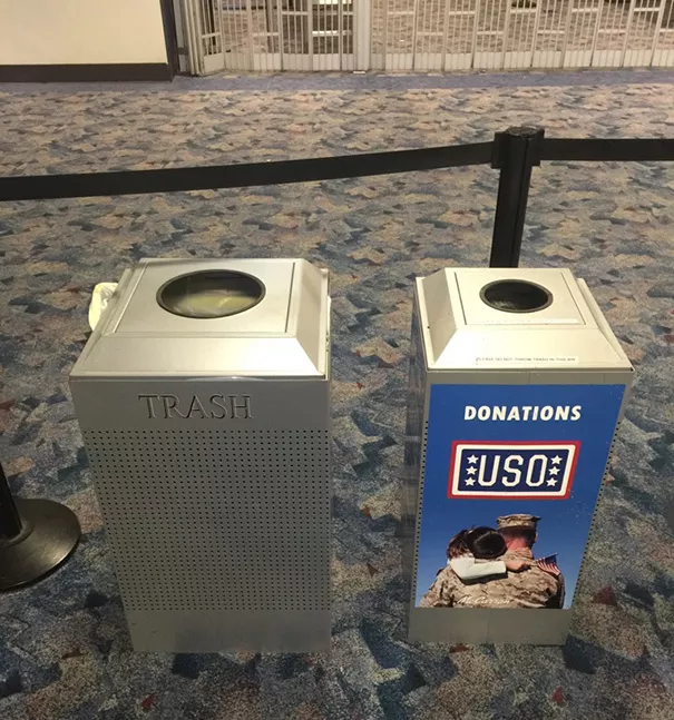
45. Pretty sure the donations were generous
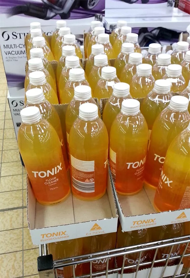
46. Looks more like soda. Danger.
47. Careful now
48. The invisible golf ball
49. Fonts, you gotta think it through
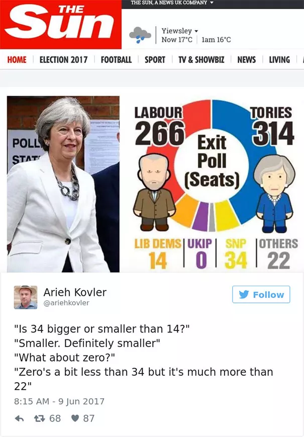
50. On point Arieh
As you can see, whether you are a cover designer, a UX designer, product designer or anything in between – people easily catch design mistakes. Poor design choices lead to a bad brand reputation, no doubt about it. Hopefully these bad design examples were enough to convince you so 🙂
Thanks for sticking with us on this fun articles about design mistakes. Check out our design articles for inspiration and useful tips on design.
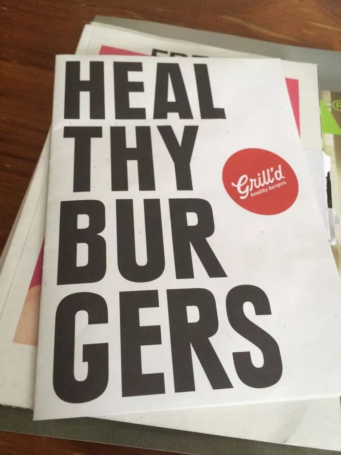
5. We’ll heal all our burgers.
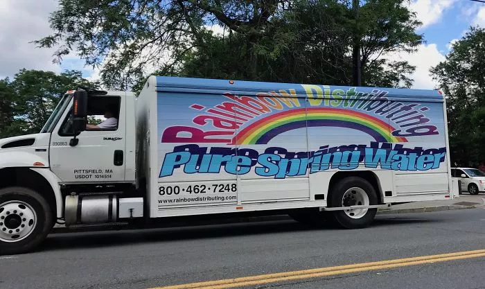
6. Can’t say it’s an honest mistake.
7. For those looking for app rentals and ice ships
8. Has this designer seen a compass before?
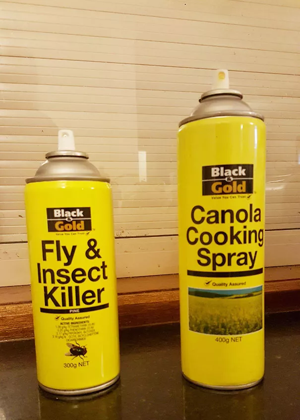
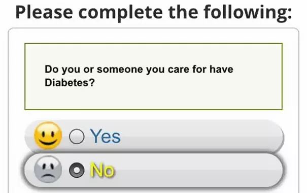
9. Ignorance is bliss
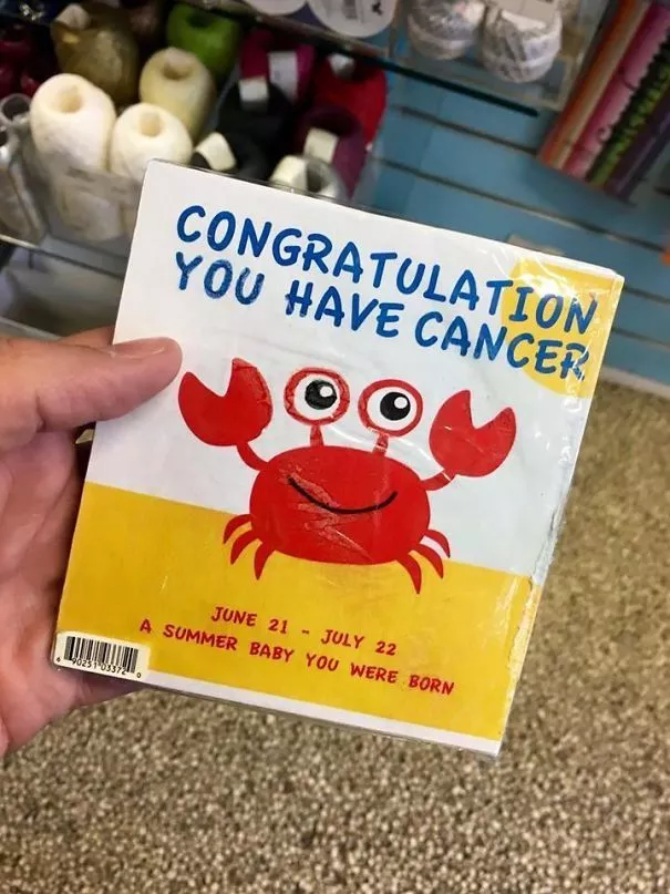
10. Should I be…sad?
11. Resume highlight: I use Microsoft Word
12. Thanks for the tip
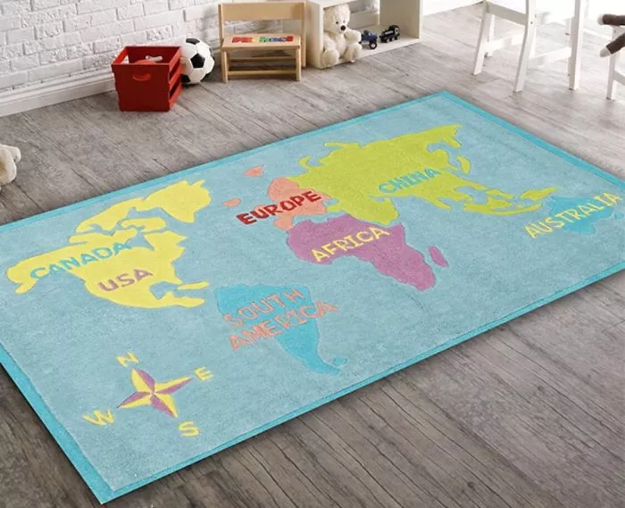
13. Looks like someone forgot Europe
14. And China is now a continent
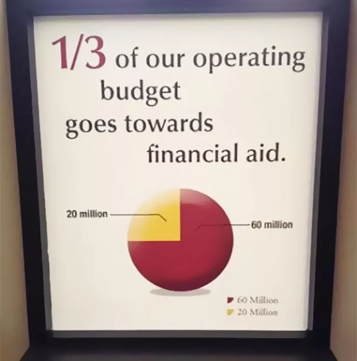
15. Did you do your math right?
16. That’s unfortunate
17. Branding gone wrong
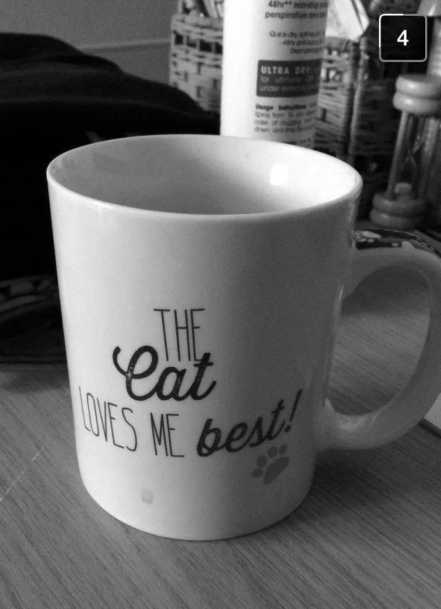
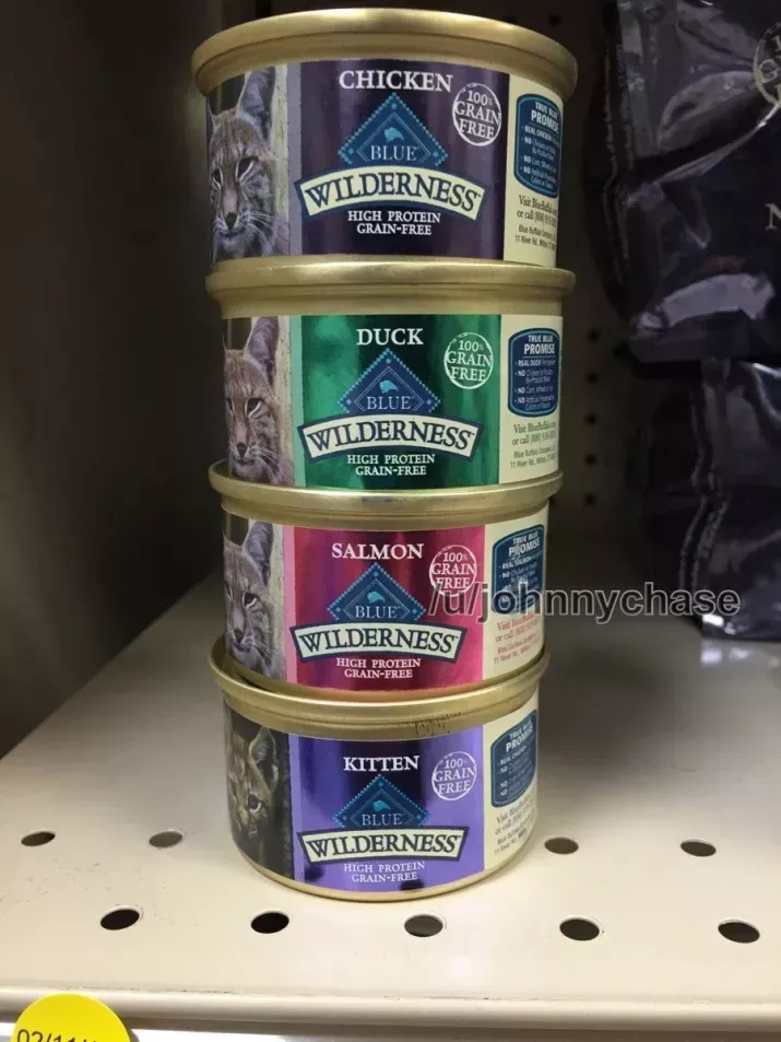
18. Would your cat like some kittens for lunch?
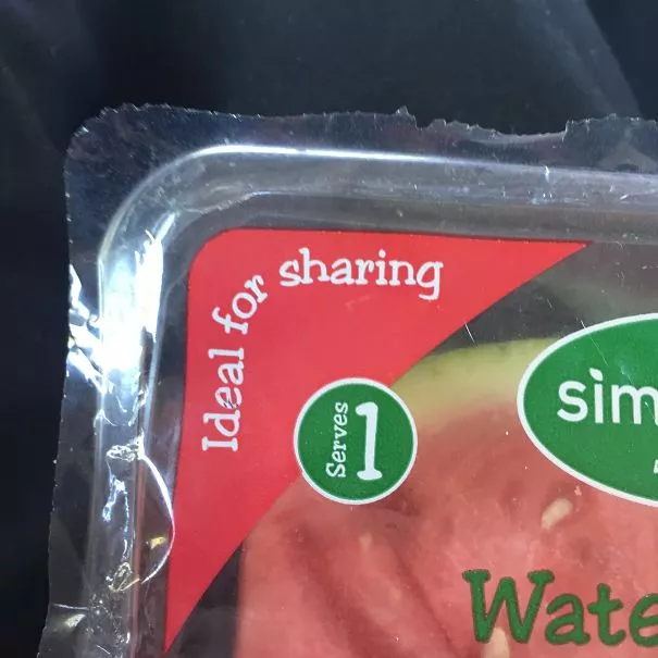
19. Joey doesn’t share food!
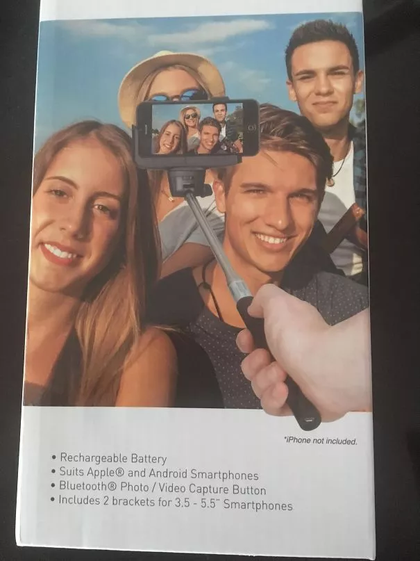
20. That’s not how the selfie stick works…
21. Really?
22. Someone didn’t think this through
23. Excuse me, waiter? What would you recommend from the list?
24. If you squint, you barely notice the mistake
25. A great example of how color choices matter
26. I just lost my appetite…
27. The legend is spot on
28. Nice try though!
29. Objective: confuse consumers to buy stuff anyway
30. A designer’s kerning nightmare
31. Not sure if awful font, or awful quote
32. Must right left
33. The importance of visual hierarchy
34. When you put in 0 effort
35. Someone thought the watermark was pretty
36. That’s disgusting.
37. I’m sorry, what?
38. That’s not how venn diagrams work, but okay
39. I want some pdelicious pineapple cake
40. They might be perfect, but…
41. Hmm…happy time ion hot hair dry care?
42. Very innovative DVD
43. A failed hashtag
44. The road to nowhere
45. Pretty sure the donations were generous
46. Looks more like soda. Danger.
47. Careful now
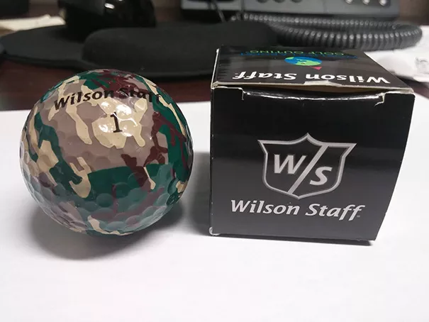
48. The invisible golf ball
49. Fonts, you gotta think it through
50. On point Arieh
As you can see, whether you are a cover designer, a UX designer, product designer or anything in between – people easily catch design mistakes. Poor design choices lead to a bad brand reputation, no doubt about it. Hopefully these bad design examples were enough to convince you so 🙂
Thanks for sticking with us on this fun articles about design mistakes. Check out our design articles for inspiration and useful tips on design.
Try hitting the tab key and notice how the focus stays within the modal itself. Also, esc to close modal.
VistaCreate E-Book
How to Stand Out from Your Competitors
Learn how to start showing up on your customers’ radar, find out how to strengthen your brand and stand out even in the most crowded markets, and figure out how to make your marketing stick. The recipe for SUCCESS — literally — is inside.
Downloading your file. If the download does not start automatically, click here.
VistaCreate uses cookies to provide necessary site functionality and improve your experience. By using our website, you agree to our Privacy and Cookie Policy.