Famous fonts that made history (and font combinations for your next design)
Do you ever wonder why some fonts are just naturally more recognizable? You certainly have a few you lean towards when creating a design.
Every font has a story to tell. From Helvetica to Futura, Bodoni, and even Comic Sans, fonts allow companies to transmit their messages and build solid brand associations. But what’s special about the world’s most popular modern fonts? How are they used? How do you know which fonts to choose from dozens of others as you’re creating your next design?
This article will dive deep into the history of some of the most famous fonts out there, as well as offer some practical advice on font pairing. If you’re searching for font combination ideas for your next design, keep reading.
7 famous fonts that left a legacy in the world of design
1. Helvetica

Designer: Max Miedinger and Eduard Hoffmann
Release year: 1957
Name a more iconic font. We’ll wait. Helvetica, or Neue Haas Grotesk, is, without a doubt, one of the most popular fonts in a designer’s arsenal. It is characterized by its tall x-height, oblique style, and tight spacing between letters. Helvetica’s story dates back to 1957, when a Swiss designer, Max Miedinger, intended to create a neutral font. Turns out, he hit the nail on the head: Helvetica is now used by lots of companies in their logos, branding, websites, and more.
To name a few usage examples, Helvetica appears in Behance, BMW, Motorola, Tupperware, and other brands. Interestingly, many governments also resort to Helvetica in their communications, as federal income tax forms in the US are presented in Helvetica, and the New York Subway uses the typeface as their main font choice.
The wide popularity of the typeface was praised in movies, particularly “Helvetica” of 2007, released on the fiftieth anniversary of the font’s creation.
Pairing advice: pair this font with Bodoni to add contrast, Georgia for classic mood, and Raleway for a more modern appearance.
2. Times New Roman

Designer: Stanley Morison, Victor Lardent
Release year: 1932
Your university term papers. Presentations. Newspapers. Times New Roman is yet another stylish font that is just about everywhere.
The typeface initially appeared in The Times issue of October 6th, 1932, introduced by the designers specifically for this purpose. The newspaper stayed with this font for over 40 years. Even though the font is almost 100 years old now, it remains one of the most popular typefaces, regarded as elegant and classic. And we should never forget the classics.
Though Times New Roman set pretty high standards for the printing industry, its usage went further. APA, an American Psychological Association, suggested this font be used in APA-style papers. Times New Roman later paved its way into book publishing and printing, too.
Pairing advice: pair this font with Arial, Helios, Avenir, and other font families to achieve a classic and modern combination.
3. Arial
Designer: Robin Nicholas, Patricia Saunders
Release year: 1982
Arial is a font of neo-grotesque style included in all versions of Microsoft Windows, Apple’s macOS, and other applications. As one of the most versatile typefaces, Arial can be successfully used in advertising, magazines, reports, posters, and logos. Known for its soft curves, Arial is quite similar to Helvetica, so the two fonts are often used as substitutes.
What’s particular about Arial is that it’s used by many famous brands. Twitter and Google used this font for their content.
Pairing advice: pair this font with Helvetica, Georgia, Verdana, Oswald, and other typefaces.
4. Bodoni

Designer: Giambattista Bodoni
Release year: late eighteenth century, revived in 1909
Often called one of the most elegant typefaces ever designed, Bodoni is a serif font with a particularly classic mood. To create this font, the designer searched for inspiration in the works of type designer John Baskerville.
Bodoni is characterized by geometric construction, unbracketed serifs, and contrast between strokes. What’s particularly interesting about Bodoni is that it can hardly be used in printing due to extremely thin lines.
Now, many famous brands are turning to this font to transmit the idea of luxury. Bodoni is a part of Vogue magazine’s corporate identity, as well as the font used in Zara’s logo.
Pairing advice: pair this font with Montserrat for proper contrast. For a more classic approach, pair it with Avenir and Arial.
5. Gotham
Designer: Tobias Frere-Jones
Release year: 2000
Gotham is a family of dynamic fonts that is set to win hearts. The font has a good geometric structure and emits clarity. Many designers favor this font for its modern appearance, fresh lines, and overall applicability.
Since its creation, the font was used in Barack Obama’s 2008 presidential campaign — particularly in advertising materials. It was also featured on the Freedom Tower at the World Trade Center site.
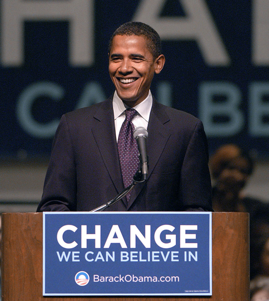
The font can be used in logos, presentation materials, and other branding purposes. It looks good both in digital and print materials.
Pairing advice: pair this font with Bitter, Antenna, and Mercury to achieve your design goals.
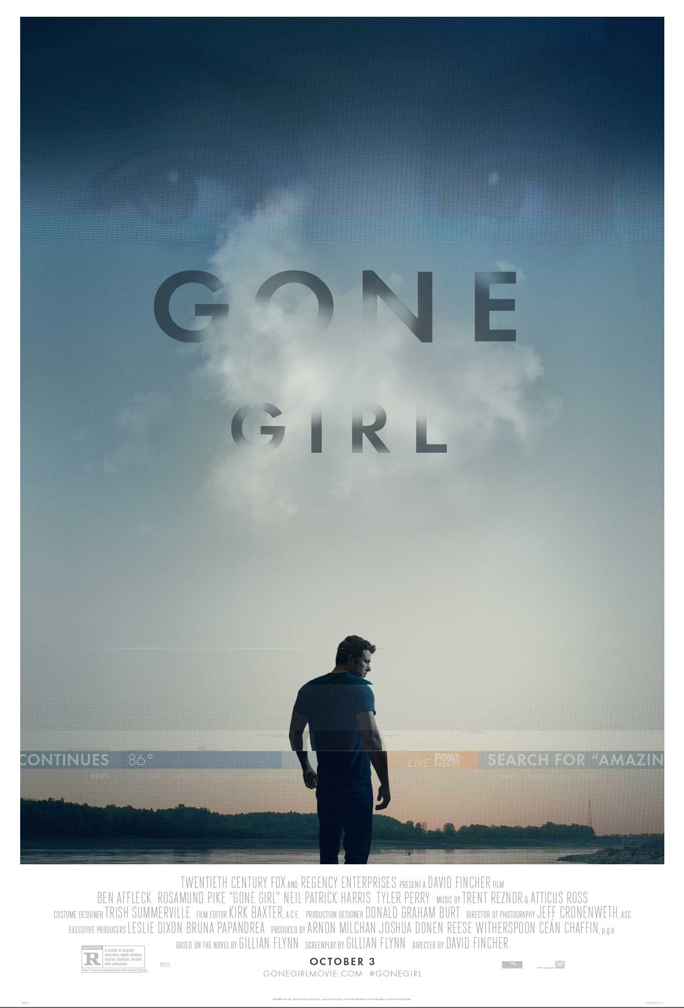
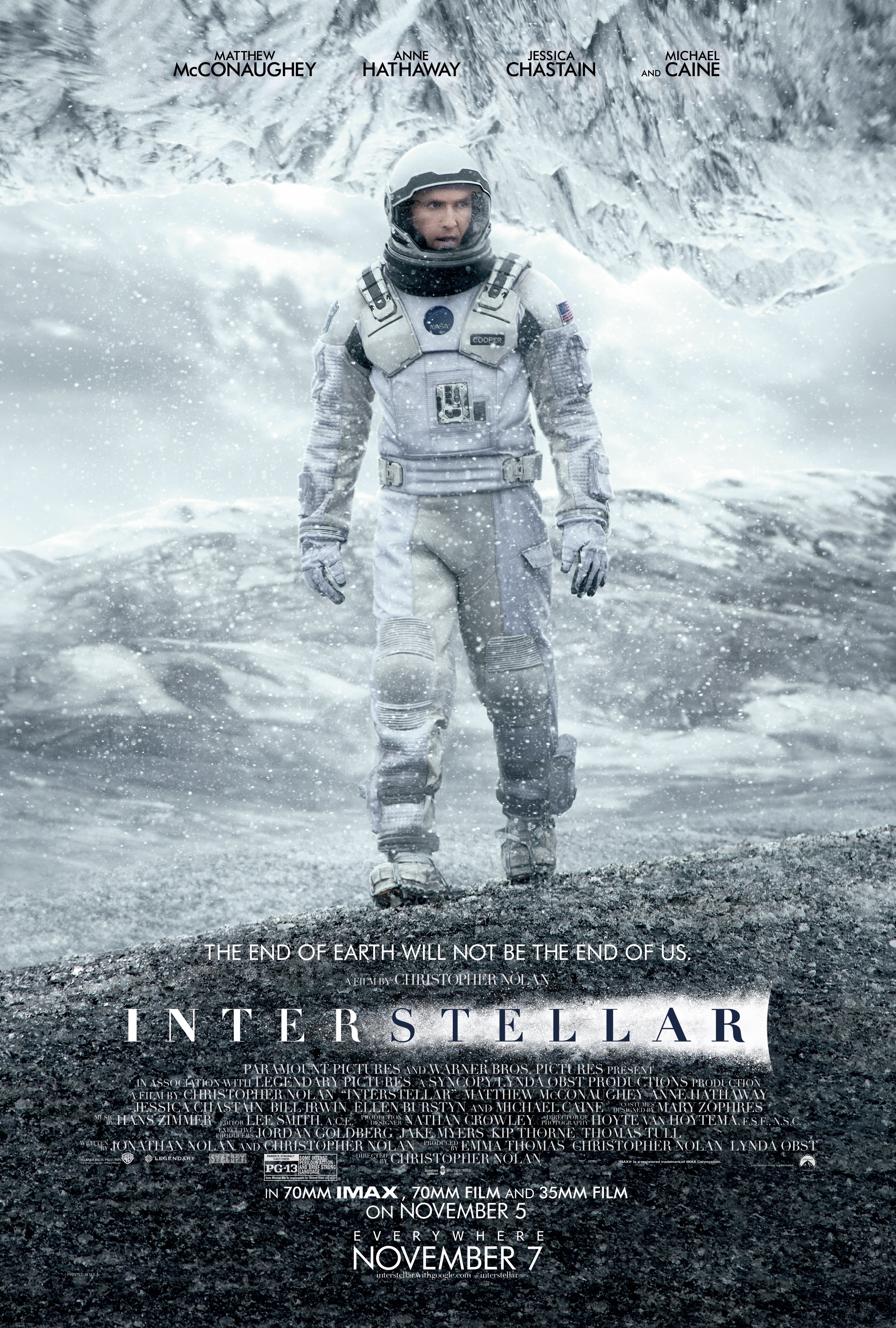
6. Futura
Designer: Paul Renner
Release year: 1927
Recognize this font? Futura is yet another typeface that deserves an honorary mention on our list of the most famous fonts. Paul Renner, the designer, believed modern fonts should not rely on previous designs but rather introduce an all-new approach to typefaces.
Futura is famous for its geometric shapes, condensed lettering, and strokes of almost even weight.
As for its usage by companies, Futura can be seen in designs by IKEA, Volkswagen, Crayola, and Absolut. Futura has also found its application in video games, as well as posters for movies like Gone Girl and Interstellar.
Pairing advice: pair this font with Lato, which represents stability, Open Sans for your website and mobile design, and Helvetica.
7. Comic Sans
Designer: Vincent Connare
Release year: 1994
Surely, this list wouldn’t be complete without Comic Sans. We bet you’ve used it in your high school presentations before.
The font was designed by Vincent Connare in 1994, after he deemed Times New Roman inappropriate for cartoon speech bubbles. It left its legacy and appeared in Microsoft 3D Movie Makers and is now among the classic font options out there.
For that era, the font was well accepted, but now, the typography is subject to lots of critique. Mainly because it was overused. You can find it pretty much everywhere — on small business websites, in books, logos, advertising, flyers, presentations, and even elevator announcements.
Pairing advice: pair this font with Ubuntu to add simplicity, and Tiempos Text or Maven Pro for better contrast.
How to choose fonts for your next design with VistaCreate’s Styles feature
Now, how do you choose fonts for your upcoming design project? Of course, you can start experimenting with font pairings on your own. But we have a better idea.
Head over to VistaCreate for dozens of free premade font pairing options that you can use in your company’s social media designs, posters, Youtube covers, and more. Choose your template, go to the “Styles” block on the left, and start applying font combinations until you find your one and only.

Here are just some of the font combinations to choose from:
Yeseva One and Roboto
Rammetto and Comfortaa

Marmelad and Montserrat
Remember, you can always add company fonts to your Brand Kit. That way, they’ll be stored in one place, and you can easily apply them to designs in seconds.
Interested in more? Check out the following articles: