Maybe you’ve heard that there’s more to marketing than meets the eye.
It’s not true.
Well, not always anyway. Sometimes, good marketing is all about what meets the eye.
That’s why savvy marketers focus on the magic of digital design and animation to enchant viewers — and get their message across.
It can be powerfully bewitching.
Whether you’re walking to the subway, catching the bus, or doing some much-needed online retail therapy, marketing with great digital design and animation naturally grabs your attention.
You have to look at it. Even for a moment.
It’s an irresistible magic that muggles are helpless in the face of. Research shows that people stay on a web page with animation over twice as long as they do for a page with no animation.
Wouldn’t it be great to be able to weave some of that wizardry into your own business’s marketing?
“But I’m just a marketing muggle!” I hear you cry.
Not for much longer. This post is your Hogwarts letter. By the end of it, you’ll have uncovered the secrets behind the magic of digital design and animation (with some fabulous examples of course).
And you’ll know how to make your very own design magic with just a wave of your wand (or mouse). No strange bearded men with pointy hats needed 🧙
Or graphic designers and animators for that matter.
Hold on to your broomstick; let’s dive in.
What’s digital design and animation exactly?
Animation is a visual art where any still figure (or object) is made to look like a moving image.
The first thing that may come to mind when you think about animation could be a memory of watching Saturday morning cartoons with a bowl of cereal.
But animation isn’t just used for cartoons or anime. Corporate videos, explainer videos, and commercials all use it — to great effect.
Digital design, however, is part of graphic design. It’s any form of visual media that’s specially designed for the screen. Apps, YouTube videos, websites, and online banners are some examples of where digital design is used.
Sometimes the line between digital design and animation gets blurred. Motion graphics, for example, combine the two by animating graphics to create an impactful message.
The power of digital design and animation
Using digital design and animation in your marketing can have a spellbinding effect. They can help you:
- Stand out and increase brand awareness
- Create better engagement with your customers
- Build customer loyalty
- Increase click-through rates and conversions
- Attract more customers (and sales!)
The secrets behind good design
Before we take a look at some enchanting examples, it’s good to know what makes a good design.
That way, you’ll be able to see the principles in action (and get inspired to use them for your own marketing😉).
A good design is one that stops you in your tracks and clearly expresses a message. A picture paints a thousand words and a good design should be able to do just that — communicate without needing many (or any) words, as you’ll soon see.
A good design is tailored to the medium that it’s using (whether that’s a website, mobile app, video, etc.). It also creates an easy user experience.
But what tools does a design use to share a message?
It uses:
- Color combinations to grab attention, express an emotion or mood, and allow the text to be legible
- Negative space
- Proper alignment of visuals and plays with symmetry
- Contrast
- Size and scale
- Visual hierarchy (the most important message appearing bigger)
- The right font combinations
- Texture
- Shape
- Repetition
9 digital designs and animations that make marketing magic
1. Moo – Just CUT!

There’s some astonishing magic in this email: It’s moving!
Not many emails seem to do this. But using animation in an email (or anywhere really) is a proven way to retain muggles and increase engagement.
In this case all it takes is a little GIF.
And the scissors tease us by being so close to the string. We just HAVE to cut the string and pop that balloon. We want to know what’ll happen next. It plays on our fascination with the unknown.
This email’s a quirky, fun, and creative way to grab attention. Just incorporating a little bit of animation in your marketing emails can go a long way.
Who knew an email could be so fun?
2. Google – Your Plan, Your Planet
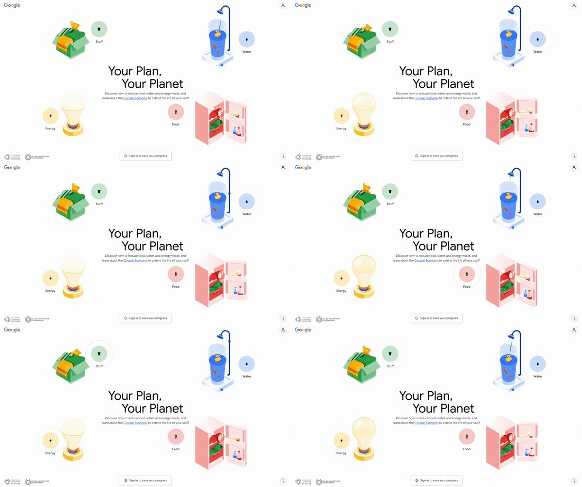
On this website, Google gives users advice on how they can adopt a more sustainable lifestyle.
Imagine just putting that advice as a block of text on a page.
It wouldn’t engage anyone like that, would it?
And with a topic as important as sustainability, you have to engage. So how do you do that?
Once again, with animation. Little touches of movement like the four topics swooping in (or the cute teddy bear waving) hook you in and encourage you to take action.
The site itself is very simple in design. It’s clean and uncluttered. That means that the animation stands out more, making it even more effective.
Google has also gone beyond animation here and made it interactive. Placing food where you think it stores best, for example, has gamified the information.
It’s so much more intriguing than a block of text.
Google has tailored the information to its medium perfectly.
And that’s what good marketing should do.
3. Komuso

Not all beautifully designed websites need to contain animation.
Komuso’s doesn’t, but it’s still effective.
This brand offers a breathing tool that’s designed to relieve stress.
But did you notice that their website design does the same thing?
It shares the main benefit of the product through its design. It has a calm, relaxing color palette along with plenty of negative space, giving you room to breathe (couldn’t resist).
And, while their site is still soothing, it gently plays with the alignment of text to grab your attention.
Their website is user-friendly, scrollable, and has clear buttons that encourage action.
What Komuso’s website goes to show is that something simple, with a solid foundation of design principles can still be spellbinding.
4. Summer Fridays

Your social media posts shouldn’t be neglected when it comes to design.
A well-designed post is what will stop people mid-scroll, and get them to pay attention.
Like Komuso, Summer Fridays has used an incredibly simple design in this Instagram post.
And it works.
The contrasting colors, large font, and clever use of negative space all combine to stop you mid-scroll.
What’s simple often works best.
5. Nike
Speaking of stopping you mid-scroll, this will do the trick.
And it’s on the opposite end of the spectrum to Summer Fridays.
Striking visuals, movement, flash frames, repetition, contrast, and scale are just some of the design principles used in this video.
Even though simple and understated works, so does going big and bold. Maybe the lesson here is to never go for the perfect balance between simplicity and bold visuals.
Because when something is off-balance, or unusual, that’s when you notice it. It stands out.
Otherwise it’ll just blend into the background.
6. Nutrisystem

“A banner ad?!”
Yes, a banner ad. Even though banner blindness is real, banner ads can still work their magic — with the right kind of design.
This Nutrisystem banner has bold, contrasting colors that catch your eye, and uses visual hierarchy by putting “Just $249” in large font. You can’t ignore what Nutrisystem says here.
What’s more, the striking contrast between the smiling woman in the yellow jacket and the rest of the banner draws your attention, as does the bright orange call-to-action button.
It’s a well-executed design that’s been perfectly crafted for its medium.
7. Nespresso on ice. You’re just a sip away
Like the most breathtaking moments in life, no words are necessary in this animated ad.
And that’s how you know it’s really good.
Think about it: It’s able to clearly share its message with simple animation.
No voiceover needed.
You instantly associate Nespresso on ice with a relaxing summer holiday. And the tagline “You’re just a sip away” is the icing on the cake.
With good design and animation, you don’t need to say much. The visuals say it for you.
8. Able – Explainer video
Want to make text more engaging?
Make it move.
Motion graphics are a fantastic combination of digital design and animation that can make the most simple text hypnotic.
In this Able video, design principles have been used throughout for emphasis. Like the paper-shredding effect on the words “paperwork.”
Negative space, repetition, visual hierarchy, contrast, and movement are all used in the video to keep you watching and to make the message hit home.
You can’t help but watch right through to the end, can you?
9. Lyft – June
Coco. Soul. Onward. Up.
Just thinking about these animated Pixar movies is enough to make you tear up 😭
Animation makes for powerful storytelling that tugs at the heartstrings of children and adults alike.
So when you harness the power of storytelling and animation in your marketing, the results can be incredible.
That’s what ride-sharing app Lyft did with this animated short film.
Sharing your brand values in the form of a story, like June here, makes a big impact on potential customers. Because people make buying decisions based on emotion first, not on reason.
If you’ve grabbed them with a touching story, guess who’ll they think of the next time they have to choose between you and a competitor?
How you can easily use digital design and animation for your business
Those were some enchanting examples of design and animation in action.
And you’re now familiar with some of the principles behind the magic.
But what now? How can you match those designs?
You might not know anything about complicated design software, or have the hours to spend mastering it.
You might be feeling especially muggle-like right now.
But remember, I promised you that this post would turn you into a bona fide design wizard or witch.
Design wizardry at your fingertips
Create professional-looking designs and animations, just like the ones above, with VistaCreate.
You can create them in seconds with just a few movements of your mouse. No design or animation skills needed.
And you don’t have to learn strange incantations either.
If the thought of starting to design petrifies you, the great news is that you don’t have to start a project from scratch.
There are thousands of templates you can choose from to base your designs around. All created by a team of professional design elves 🧝
From Instagram posts and TikTok videos to flyers and posters, there are templates for all of them.
The magical team of design elves has also put together ready-made styles, color palettes, and font combinations so you don’t have to think about what works.
And what doesn’t.
Bring life to your creations by using animation in your design. You can do this by animating the graphics at the click of a button — all without having to manipulate keyframes. Or try adding animated objects to make your design sparkle.
And if you need to create multiple formats of your design for different platforms, you can do so easily in just a few clicks. No need to start from the beginning for each one.
Now that you know how enticing good design can be, it’s time to bewitch your customers with some magical marketing.
Take inspiration from the examples you’ve seen today and see if you can use some of their principles in your very own designs.
Greater engagement, higher click-through rates, and more customers — you have everything to gain from it.

