Working on your business promotion? Leverage good design with 9 tips
If you still believe that design doesn’t play an essential role in your business’s success, think of brand names like Nike, Apple, or Netflix. Most likely, you’ll recall these company logos in a flash. They also all have a very distinctive style, and that’s because their designers did a great job.
This doesn’t mean you can’t achieve similar results without a professional! With industry-specific templates and formats from VistaCreate, you can create stunning designs for small businesses on your own.
Many people believe design is all about how things look, although that’s inaccurate. Design is an essential part of a successful business strategy and brand communication. You can express your brand’s vision, values, and mood with the help of visuals, and as a result, gain your clients’ trust.
There’s also a modernistic approach to design that can be described in a single phrase: form follows function. This principle implies that the design of a building or an object should relate to its purpose. Steve Jobs once shared a similar idea:
Most people make the mistake of thinking design is what it looks like. People think it’s this veneer — that the designers are handed this box and told, ‘Make it look good!’ That’s not what we think design is. It’s not just what it looks like and feels like. Design is how it works.
Now that you understand the power of good design, let’s figure out how to create balanced and appealing graphic designs for businesses, whether it’s an Instagram story or a restaurant menu.
Let’s dive into designer tips and tricks on:
- Composition
- Colors
- Fonts
Keep calm: this is not going to be a complex lecture on design with tons of materials. Instead, we’re aiming to create a simple guide on design for small businesses. Take notes or save it for when you plan to design.
Composition tips and tricks
Most people don’t think of composition when looking at a design because a good composition is one we don’t notice. On the contrary, you can feel when something is wrong with a picture. The human brain likes to see logic, structure, and patterns, so composition is crucial in appealing business graphics.
Tip #1. Don’t clutter a visual
Before starting a design, define its main goal and stick to it. It’s easy to fall into the temptation of saying/showing all of your brand’s perks simultaneously, but it’s not effective. Remember, the clearer the design, the clearer the message.
Object lesson: if you’re promoting a quick and easy food delivery service, focus on this. Don’t mention other benefits, like authentic recipes or local ingredients — save these for the following posts.

Tip #2. Create 1-2 accents in a composition
Before creating a design, think of what you want your clients to see first and accentuate it. For instance, it can be a product, its description, or a sale.
By the same token, don’t try to accent too many things at once. You’ll scatter your client’s attention, and they won’t understand what you’re trying to say. As a result, a design like this won’t bring any value to your business.
Object lesson: if you’re promoting a new skincare product, focus on what it is, how it looks, and maybe how much it costs.

Tip #3. Place designs elements in the center, on the sides, or in the corners
There are basic rules on how to place design elements. If you don’t have a design background, it’s important to follow them so that you end up with a balanced visual:
- Place your design elements in the center
- Сreate symmetry: place design elements on both sides of a picture (right and left, or top and bottom)
- Place design elements in the corners of an image or diagonally
Object lesson: look at VistaCreate’s templates for the travel industry to see how designers use these composition principles in their work.

In the center

On the sides

Diagonally
Color tips and tricks
Color is crucial for business graphic design: 93% of customers make their purchasing decisions based on how products look. For example, one of the most common web design tips for small businesses is to use bright colors for buttons, as this affects whether a user clicks them.
Besides, it’s crucial to explore colors, the meanings behind them, and the emotional response they evoke before choosing a palette for your brand. The VistaCreate Colors project was created for this particular reason — check it out!
Tip #4. Stay color consistent
Successful businesses usually have brand kits to ensure design consistency throughout all platforms. They include a color palette (usually based on logo colors), fonts, tone of voice, etc. Besides, design guidelines also make it easier for companies to work with contractors — graphic design businesses, advertising agencies, or branding services.
So, although every year brings new color trends, you shouldn’t necessarily follow them as a brand. Think of McDonald’s — you recognize it wherever you are for a reason. This company spent years using yellow and red in all of its marketing materials. As a result, you associate this brand with these colors. Now imagine your confusion if McDonald’s were to change their palette to pink and orange. Wouldn’t that be Dunkin’ Donuts?
Tip #5. Use up to 3 colors in a design
It might sound strange, as designers often use photos for small business designs, and they definitely include more than 3 colors. However, this doesn’t refer to photos or neutral backgrounds. Instead, this implies design elements, like text descriptions, objects, or frames.
Design elements accentuate, and as you already know, too many accents create a contrary effect. So don’t try to use every color from your brand palette at once. Instead, aim to create minimalistic visuals to make it easier for customers to understand what you’re communicating.
Object lesson: you don’t need many colors and elements to create a festive greeting card or a holiday sale post. Choose 3 colors (4, if you need a different hue for the background) and work with them. You’ll be surprised by the results.

Tip #6. Match template colors with a photo palette
When creating a visual with a photo, make sure to use the photo’s color palette for all design elements. This will help you to create a well-balanced visual. At the same time, you’ll be able to follow the previous “up to 3 colors for a design” rule.
Object lesson: picture this — your travel agency is a jungle tour organizer. You want to promote it using photos of beautiful forests, lakes, and tourists in khaki clothing. Perfect! Now imagine adding a bright pink text block to this design. Your nature-inspired aesthetic will be lost in a flash.
🔥Pro tip from VistaCreate 🔥
Creating a color palette for a brand can be challenging and time-consuming. VistaCreate launched a new Styles tool to make this task easier for small businesses. With this feature, you can experiment with font and color combinations, browse different options, and choose the perfect one for your brand. Bring your graphic design business ideas to life!
Font tips and tricks
Fonts navigate designs. They are used to guide readers through a visual and deliver a message. They are also used for logos to strengthen a brand image. For example, the font for Walt Disney looks playful and magical, which adds to the fairytale association.
Tip #7. Make your text readable
Fonts are art. You can use already existing ones, create your own with the help of an online font generator, or even with a pen — the options are endless. But when experimenting with fonts, remember that you’re trying to convey a message. So, however beautiful the font is, don’t use it if it makes your text unreadable.
Object lesson: when using decorative fonts for your business graphic design, make sure the text is clear. For example, you can use decorative fonts for short accent copy, just like VistaCreate did with event industry templates.
Tip #8. Use up to 2 fonts in a design
This brings us back to a cohesive design that won’t work with a variety of fonts or colors. Use one font for the main message and another for the supporting copy. Also, experiment with text sizes and colors to set accents.
Object lesson: you can use different text sizes for storytelling. Readers usually skim through messages, starting with the largest and ending with the smallest text. Mind this when creating a poster for a fitness app or a gym. Get inspired with VistaCreate’s examples for the sports industry.
Tip #9. Make text proportional to the layout
When working on laptops or smartphones, your text might seem too small at times. Unfortunately, this leads to common mistakes in small business graphic design: huge logos that almost shout at clients, messages that occupy the entire layout, and text appearing over products or people. All these things can negatively influence your brand’s reputation, so try to avoid them.
Mind your layout when creating a text block: it should be proportional to the size of your visual, no matter what you create.
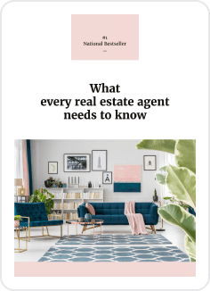
Object lesson: you can always highlight your message using bold fonts or different background colors. Check out VistaCreate’s ready-to-use solutions for the real estate industry for more inspiration!

🔥Pro tip from VistaCreate 🔥
Check out the VistaCreate’s Brand kit feature. It allows you to add your fonts, color palettes, and logos to a brand kit, and easily access them anytime you need to brand your content.
Wrapping up
There’s no need to hire a designer to create small business graphics. Follow these simple design tips on composition, color, and font to promote your business through various digital platforms:
Tip #1. Don’t clutter a visual
Tip #2. Create 1-2 accents in a composition
Tip #3. Place designs elements in the center, on the sides, or in the corners
Tip #4. Stay color consistent
Tip #5. Use up to 3 colors in a design
Tip #6. Match template colors with a photo palette
Tip #7. Make your text readable
Tip #8. Use up to 2 fonts in a design
Tip #9. Make text proportional to the layout
Let’s make it 10 with an additional tip from VistaCreate designers! Add videos, animated objects, and music to your designs for better engagement. Try using animations for your social media to make your feed more lively, or create an animated logo to follow the latest design trends. Follow VistaCreate for more design and marketing tips!


