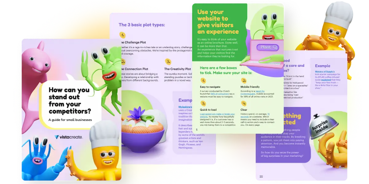
Elevate your designs with masterful copy and say goodbye to Lorem Ipsum
The year was 44 BC, and panic swept the streets of Rome.
Dear Brutus and his not-so-merry gang of assassins had just carried out their deadly attack on Julius Caesar, leaving Rome leaderless, and its people misinformed.
“We must tell the people what we know!” cried Mark Antony. “We have the address designed to perfection, but we must get the message right. If only we had some placeholder copy in the meantime.”
“Do not fret, my dear Mark,” came the soothing reply of his trusted confidant, Lorem Ipsum of Pompey. “I know just the thing.”
True story.
But while Caesar’s life came to a swift end, the life of Lorem Ipsum trailed on, and even to this day designs still use this form of placeholder text.

But isn’t it time for designers to finally do away with these dummy words? After all, this is a bunch of “Latiny” words whose name derives from the actual Latin for “pain itself” — a sure sign that there’s a better way.
“But I’m a designer, not a copywriter,” you might say, and we hear you. That’s why we’ve put together this guide, which gives you some tips and tricks on how to perfectly marry your designs with text so you can excite, delight, and enthrall your audience without the help of our pal Lorem.
Make sure you read till the end; to make this article extra practical, we reached out to three marvelous professional designers, Marijo Mrnjec, Natalia Michalak, and Vuk Nesic to share their wisdom and offer exclusive insights.
So let’s get stuck in, shall we?
Oh, and don’t forget that you can always rely on VistaCreate to create a design:
Pick the right image
As all of you designers out there know, you can’t simply grab any old image, slap some text on it, and Bob’s your uncle, Jenny’s your aunt, you’ve got yourself a design.
Whether you’re making use of free domain images or taking the photo yourself, you need to make sure it’s a photo that lends itself to having a text overlay. That means it needs to have an appropriate amount of space for your text — unless you’re going for some purposeful overlaying or covering up (more on that later).
Take these covers of the magazine 5280:


These guys make use of a common technique for pairing images with text — pick a picture with a skyline (and now you know this little tip, you’ll see it everywhere).
A nice clear skyline gives you a perfect opportunity to pop some text in to bring out the power of the image with text, without obscuring the image itself.
From a marketing perspective, the image you choose can also say a lot about your brand. Take upscale supermarket brand Whole Foods Market as an example:

This design is simple and straightforward, but also packs a whole bunch of subtext in.
Everything in the image looks fresh, healthy, perfectly formed, and neatly stacked. It’s an image you can almost taste and smell.
From this picture, the first thing that you can see is that Whole Foods Market’s products can be delivered to you. Nice and simple. But if we scratch just a tiny bit under the surface, we could also deduce that their products are fresh, organic, and seasonal, and we may even think that they’re saying they’re eco-friendly as their delivery truck’s fumes are also fruit and veg.
And then to top it all off, you have some lovely white space that highlights “Whole Foods Market.”
Very classy, very good.
Choose your font carefully
Did you know that there are over 200,000 different fonts that exist out in the wild?
Pretty crazy eh?
So when it comes to picking which font you want to use in tandem with your designs, it would be fair to say that you have a wide range of choices.
Of course, the first few that spring to mind might be the classics such as Times New Roman, Arial, Calibri, or Lora (Comic Sans anyone?), but when you’re trying to create a unique design, it’s sometimes best to choose a font that isn’t instantly recognizable.
And part of this need for originality is because you want your font to both match your imagery and showcase the personality of the piece.
Your font can convey warmth, aggression, humor, edginess, youthfulness, class, or any number of other things. That’s why it’s so vital that you pick and pair the right font for your design.
Take this for an example:

This text design is used to perfection, with the words forming the slightly melty ice cream.
Or how about this youthful, playful example of typography?

This is a font that perfectly pairs not only with the imagery, but also with the audience. It mimics the slightly scribbly, bold handwriting of the child that will most likely be reading this and who will then be asking their parents if they can get their hands on a stuffed toy that they drew.
Your fonts can make or break your designs. Also, pay a lot of attention to how fonts work with each other, whether or not they’re scalable. Consider the industry you’re creating a design for. For example, when crafting a design for a tech company, you can use small superscripts and a sans-serif font, such as Manrope.
Yevhen Chuhuievets
Position your copy for maximum effect
So you’ve got the right font, the right image, and you’ve paired them up together nicely. Great work, easy stuff, let’s wrap it up and finish by 4?
Not so fast bucko.
The next thing you need to make sure you get right is the positioning of your text. It may not sound like much, but if you don’t get the layout of your design right you could end up with something like this:

But positioning isn’t just about avoiding funny, meme-worthy mistakes. It’s about creating the perfect match of image and text that means one doesn’t detract from the other.
In most cases, a non-trained person doesn’t know why certain designs evoke certain feelings in them. The design’s composition and color palette affect people on subconscious level. Is the composition dynamic or static? Does it create a sense of stability or does it evoke tension? The composition of your piece should mirror the message it’s trying to deliver.
Vuk Nesic
Take this front-cover image from nature magazine Nature:

Of course, you have the gorgeous image of the wolf (who’s a good boy then?!), but look how the text is positioned around the focus of the image. You’re instantly drawn to the focal point of the wolf’s eyes, but they’ve still managed to make the words “Canine connection” stand out without covering up the important, eye-catching parts of the wolf.
On the theme of magazine front covers, let’s take a look at an example of bad text placement from the American monthly fashion and entertainment magazine Cosmopolitan:

Here we’ve got a mishmash of fonts, sizes, and colors; seemingly random placements; difficult-to-read text; and next to no respect given to the image itself (not that we’re being mean or anything).
The main issue here is that you have no idea where to look first; there is no immediate focal point. That means your eyes will aimlessly wander and scan from side to side trying to find something to latch on to — so any potential impact is completely lost.
Which powerfully illustrates why placement is so important.
Indeed, proper text placement saves lives:

And as we’re on the topic of text placement, it would be crazy if we didn’t mention that you should always…
…make use of visual hierarchy
Visual hierarchy is the term used to describe the order in which all of the elements of a design are arranged so that they can be easily understood by the reader.
This isn’t just a design thing; in fact, visual hierarchy applies to pretty much everything. Whether that’s art, architecture, literature, or websites — they all have a nice and tidy order in place.
But why is this important for you?
Because when you are pairing your images with your text, you want to take the viewer on a journey.
Remember the “Don’t save a life, be afraid to give blood” image? That’s a perfect example of a poor visual hierarchy — there’s no obvious order, so you end up having to use basic logic to make your own (with slightly hilarious consequences).
When you follow the rules of visual storytelling, you take that choice away from the reader (but in a nice way) so that there’s no room for misinterpretation, giving them a better all-around experience.
Take this Digitalll advert:

They make use of a left-to-right, zig-zag hierarchy that makes perfectly clear to the reader how they should read it. Even though they mix up which side the text is on, you very clearly go “left, right, left” with the brand name tying things up at the end.
But you don’t have to stick to a linear design, where you start at the top of the page and finish at the bottom. By making use of a variety of tools such as color and size, you can take people on a different yet still crystal-clear journey:

So here, your eyes will naturally gravitate toward the largest text that’s right in the middle and highlighted with a white background. Then you’ll move to the second-largest bit of text and so on, and you’ll actually naturally finish with the text that appears at the top.
The main rule of composition when working with text is to create contrasts. The worst thing you can do is bore the reader. Short text blocks in small print should alternate with large quotes and headings. The text must be dynamic.
Yevhen Chuhuievets
(Psst, follow this link for a more in-depth guide to visual hierarchy!)
Don’t be afraid of white space
When you’ve got a lot to say, whether that’s in your text or your design, the temptation can be to fill up every single spare inch of space available. Why waste space when there are a million and one things you want to show off?
The answer lies in the power of white space.
You know when you’re watching a horror movie, but instead of showing the gory bit, they cut away? Do you ever think that’s scarier than when they actually show the nastiness? It’s because the filmmaker is leaving that part up to our imaginations, which can do far more than some red dye and cornflour can.
And it’s the same with white space.
Contrary to the name, white space isn’t literally space that is white.
It’s simply space in the design that is left untouched. It can include the space between lines of text, empty space in the image, space between the various elements, and so on and so forth.
Using white space is an invaluable technique for a number of reasons. It makes things easier to comprehend, it brings focus and attention, it creates a bit of breathing space for the reader, and it can actually boost interaction rates for adverts and other salesy things.
Take this design from Blue Marine Foundation’s interactive website “The Sea We Breathe”:

Doesn’t that image just take you on a journey? You’re already taking a minute to relax and breathe before you even read the text.
And companies have been using the power of white space for a long time, and with fantastic results too:


All of these are wonderful examples of white space marrying up with the image and text perfectly — and to great effect. They make you stop, take notice, and want to find out more.
It’s the literal definition of doing more with less.
Be bold
Pairing your images with text can have a powerful effect on your design. It can give your audience a focal point, it can make a statement, it can be bold, daring, exciting — the possibilities are endless.
But whilst simplicity can be very effective, it’s sometimes even more powerful to go off the beaten path a bit. Take these examples from Festival Karsh:
It’s doubtful that many designers’ first tip would be to use your text to cover half the face of a famous figure. And yet this just works.
And talking of covering things up on purpose, the designers over at TIME magazine are regularly guilty of covering up their copy with striking images:
But again, it really does work.
Of course, TIME is able to get away with this due to the instant recognizability of its brand, but it’s still a bold move to make.
Here’s another example of a design being bold:

Now this is a design that’s bound to split opinions. On the one hand, it’s very busy. There’s lots of colors, lots of shapes, a slightly strange circle in the middle that changes the color of the main text.
It’s definitely…a lot.
But on the other hand, Pest Stop Boys is a pest control company.
They rid your house of cockroaches, fleas, mites, and other little pesky critters.
That’s quite a hard thing to make stand out, and if there’s one thing that you can’t say about this design, it’s that it’s not bold. So we’re personally going to give this one to the Pest Stop Boys (also massive kudos on the pun name). They certainly stand out.
Make your copy relevant to your design
We know what you were thinking — “How are they writing a post about marrying text with images but haven’t even mentioned what I need to write?!”
Don’t worry, we got you.
When it comes to smooshing together copy and design, there are two ways you can approach it — have you got the chicken or the egg?
You know the whole “What came first?” thing?
Well it applies here. Are you starting off with some text (the chicken) that you need to pair with a design? Or do you have a design (the egg) that you want to write copy for?
In either case, you need to make sure that both elements snap together and make sense. And you can get really clever with this as well — take this example from Adidas:

This is a wonderful alignment of design and copy — one that gets the message across in a punchy, clever way.
Or maybe you want to get a bit cute with things like CanvasFlip does here on their landing page:

This is a great example of the chicken coming before the egg (we’re guessing), as they’ve taken a slightly bland piece of text and created something really wonderful to pair with it.
Want more great examples of marrying text with copy?
And now… Onto some hyper-practical tips from seasoned designers! Drumroll, please! 🥁
What designers say: 3 designers on finding balance between copy and design
Sometimes, reading through theoretical guides and flicking through bad and good examples isn’t enough to understand what it takes to marry copy with design. Sometimes, you need to talk to someone who’s already mastered this art and see what advice they got to share.
Today, we’re giving you an opportunity to get a few first-hand insights from design experts, Marijo Mrnjec, Natalia Michalak, and Vuk Nesic.
Marijo Mrnjec — a graphic designer from Nova Gradiška, Croatia, better known as BMP design. Marijo has over 20 years of experience in design specializing in design for editorial, digital, and print formats. He works mainly with companies from the financial, IT, medicine, financial, and culture sectors. At the moment his main point of interest is exploring possibilities of AI-generated design.

Designs by Marijo Mrnjec
Vuk Nesic — a graphic designer and illustrator from Serbia with 8 years of experience. Until recently he spent 4 years as a team member at the Fabulous app. His main interests are psychology, music, basketball and travels to some unexplored corners of the world.


Designs by Vuk Nesic
Natalia Michalak — a graphic design student and a junior graphic designer working at a marketing agency based in Warsaw, Poland. When not designing, Nat loves watching films (that play a huge role in inspiring her to create her personal works that she shares Instagram) or playing the electric guitar!


Designs by Natalia Michalak
— What are your best tips for creating designs based on copy?
Marijo Mrnjec: At the start, after I receive the copy from the editor, I read, analyze, and absorb the text.
If the visual hierarchy wasn’t considered alongside the content, I start off by reorganizing and synthesizing the content. I try to pick up the tone, the voice, and the style of the text.
I think about how visuals can help to better explain the topic, expand it. I identify the key parts of the copy that I can illustrate or maky more visually attractive with the help of accents.
Once I have all of that figured out, I start building a set of visual assets to use in the project — background patterns, vector icons, small infographics, and charts.
If there is something I don`t understand, I ask my editor for clarification and more explanations and guidelines. Remember, your client is your friend. You are working together.
Vuk Nesic: This reminds me of something a physician friend told me.
“When working with patients, although you have all this book knowledge, you will ultimately make best decisions based on your intuition.”
I think that same goes for the design process. If we were to follow blindly the text of a brief we wouldn’t be different from an A.I. My process lies in taking in the information, writing down the main themes, and then closing my eyes and seeing what comes up from within.
Natalia Michalak: Think outside the box. Take the copy very literally or take it in a very abstract way, leaving just a glimpse of it in the design. What’s important is the association between them. Unless you have strict guidelines, play with what you have to find unconventional solutions.
Design by Natalia Michalak
— When working on a project where copy and design are key, at which stage do you recommend you bring the two together?
Marijo Mrnjec: You need to start bringing things together early. I plan everything ahead, so as soon as I get started with the project, I develop a design draft that roughly explains how the copy and designs intersect.
I immediately figure out how much space I have available on pages for the photos, headlines, pull quotes, and other design elements. Connecting the headlines with relevant illustrations helps tremendously with keeping things organized.

Design by Marijo Mrnjec
Vuk Nesic: It depends on the project, of course. But, usually, you should be able to introduce copy to the design after 50% of work has been completed.
Natalia Michalak: It varies depending on the project I’m working on. I think it’s quite important to have both of them in mind while designing so that you’re sure that they work well together.
There is no specific recipe as to when to bring them together – I sometimes do so when I have the whole design ready, other times I lay them on the artboard all at once to make sure that they fit well together. Then, I have more visibility into the project and know exactly how much space each of the components is going to take.
— It’s essential to absorb the text to work with it. Do you have any recommendations as to how designers can do so before they start a project?
Marijo Mrnjec: It is hard to work with text that you don’t understand. If you work with a crypto company, for example, you need to understand a few things about blockchains, or if you create a design for a company in the financial sector, you should be informed about how some processes work.
I do a little research about the company and its brand style, check their social network pages (Facebook, Instagram, and Linkedin), examine the brand book and examples of previous work.
After that, I have a solid idea about the company’s values, culture, and about their target market. With that in mind, I can come up with ways to improve it, make it more interesting visually, and easier for consumers to digest.
Vuk Nesic: Being overly confident and not confident enough in your ability to match your client’s expectations can both be detrimental to the quality of the final product.
When you have no clue about what’s going on, you end up being overly cautious, which limits your creative freedom. On the other hand, when you think you got everything figured out and don’t clarify things with the client, some critical things might slip through the cracks.
Therefore, I’d say communication is key. You need to gain a solid understanding of what is expected from you, which can only come from a two-way conversation with the client.

Design by Vuk Nesic
Natalia Michalak: Research is essential. You need to know the background of what you’re designing. It’ll give you an idea of what it should look like and why it should look like this. It’s always good to know all the whys because it may give you an understanding of crucial things you may not have been aware of. Don’t forget to discuss the matter with the copywriter or the client, too!
— Which tricks do designers have up their sleeves to best capture the tone, voice, and style of the copy they have to work with?
Marijo Mrnjec: Always have your target audience, the people your design is directed at, in mind. The goal of design is to set the right form for the content. The form carries a meaning, so you have to choose the forms that communicate messages and are appropriate for your audience.
Natalia Michalak: It’s always good to know the client, their target audience and to do at least a little bit of background research. Talking to the client may also be essential sometimes, since they usually have a sense of what they would like the design to be. In other cases, just focus on the copy and consider how it makes you feel. Search for something in between, for something not obvious at the very first thought.


Designs by Nat Michalak
— What do you usually prioritise: accent on the copy or accent on the design? If it’s a balance, what’s typically the focal point?
Marijo Mrnjec: I usually don’t prioritize one over the other. I am looking for ways to integrate type with the design and vice versa.
It depends on the purpose of your design, too. In book design, you need to pay more attention to the typography, while art monography would require you to focus on images more.
You need to understand what’s the final goal of your design, think about what is important, and give it a more prominent role.
If both components are equally important, I decide which one will have more impact if prioritized. Sometimes, a big and bold headline is more effective than an image, but in other cases, a dramatic photo can speak a thousand words.

Design by Marijo Mrnjec
Vuk Nesic: I prioritize only the final result, which is successful if the feelings evoked by the design match the client’s vision. Sometimes this vision isn’t perfectly expressed through the copy, but sometimes copy plays the central role in making everything work as intended.
Natalia Michalak: I usually prioritize the design. I consume through my eyes and I believe that lots of other people do that, too.
The first couple of seconds when the person first interacts with the design are the most important, and you need to take that into consideration. They notice the visual aspect of the design first, and only if it resonates with them, they’ll spend more time studying it, examining the copy.
— Can you single out any definite design no-nos for those trying to marry copy and design?
Marijo Mrnjec: Illegible typography, lazy selection of stock images, and sloppy grids can ruin even the best concept.
Still, there are no set-in-stone rules in design.
I can`t say “dont ever broke the grid” or “never use specific color combinations”. At the end of the day, sometimes breaking the rules is the way to go.
The one thing you need to remember is that your designs need to communicate certain ideas and catch the eyes of the target audience. Other than that, feel free to experiment.
Vuk Nesic: Failing to respect the basic principles of design. Even if you’recreating the trendy antidesign designs, you need to remember that they still require a solid understanding of design pricingples. Breaking the rules only works when you know what effect you want to achieve. Otherwise, you risk creating something that simply doesn’t do the job it’s supposed to do.


Designs by Vuk Nesic
Natalia Michalak: Don’t mix more than two, max three different typefaces. Remember that in most cases, the visual components should take about 70-80% of the artwork, while the typography should take the remaining 30-20%. Learn these rules by heart. Understand them. Then, feel free to break them.
Design and copy: A match made in heaven
Design and copy really are a match for the ages.
By using them both in tandem, you can really lift your designs up to where they belong (like Jennifer Warnes does for Joe Cocker). And with these tips and tricks, you can finally say goodbye to our old friend Lorem Ipsum.
May he rest in peace next to his ol’ pal Caesar.
In the meantime, check out VistaCreate’s beautiful range of design templates for text images and create your own masterpiece.