Coco Chanel said, ‘The best color in the whole world is the one that looks good on you.’
Miss Chanel did know a thing or two about colors in fashion, so we won’t argue with her statement. But we could only wonder if the same expression can be applied to businesses.
In the modern business world, the digital realm is a company’s runway; and the social media publications they share with the audience are the figurative ‘clothes’ businesses wear.
So, the short answer is — yes, absolutely. Every design a business shares online must be on-brand and color consistent. That’s the basics of growing your brand awareness and making your content recognizable.
However, a slightly more extended answer would be — yes, but with some clarifications. Just like with anything else color-related, you also need to consider current color trends and the ‘environments’ in which your colors are ‘modeled’.
Every platform has its own rules as to what content will rack up a sizable amount of likes, views, and shares, and what content will go unnoticed. The difference between the two lies in details. One detail is the color palette each given publication uses.
In this article, we’re discussing the importance of color psychology for business success on social media and revealing the best color combinations to use on each social media platform. Make sure you stay till the end and find out which colors you should use on Instagram, Facebook, Pinterest, and Twitter to get the most likes, shares, and comments.
The significance of social media colors: Why is color psychology important for business success on every social media platform?
Businesses try to influence their audience with the help of social media publications. They publish content to prompt their followers to feel something, realize something, or take action. This can only be achieved through impact on the subconscious. So, you need to understand color psychology and how people react to different colors and combinations thereof.
When it comes to choosing the right colors for your social media posts, there are several things to consider:
- Color connotations
- Color harmony
- Color context
Connotations of colors
When choosing colors for your business social media publications, you need to have a solid understanding of the message you want to convey. It will influence your choice of color, as different colors evoke different emotions.
For instance…
- Red is often associated with passion, energy, love, excitement, and danger.
- Orange represents enthusiasm, creativity, youth, pleasure, and optimism. It’s a fun, radiant, and joyful color.
- Green is most commonly associated with nature, health, and luck. It’s also the color of prosperity, abundance, and tranquility. This color is often used to create a sense of safety and security.
- Yellow is a sunny, cheerful color that has a lot of positive connotations. The key emotions it evokes are happiness, curiosity, clarity, and warmth.
- Blue alludes to wealth, security, confidence, and trust. There’s also a strong relation between blue and a sense of loyalty.
- Pink is a color often associated with softness, intuition, gratitude, and respect. Thanks to its connection to Valentine’s Day, pink is also the color of romance and love.
- Purple is one of the most mysterious colors. It’s rich, royal, artsy, spiritual, and imaginative.
Learn more about the meaning behind different colors in our article!
Harmony of colors
Sometimes, you might want to evoke more than one emotion with your social media post. Say, you’ll want to both inspire your followers, intrigue them, cheer them up, and prompt them to take action.
This doesn’t mean you need to slap green, purple, yellow, and red onto a design. Unfortunately, there’s a high chance that using all of these colors simultaneously will create a visual mess and make your design appear unprofessional.
Every color you use in a design should work well with the rest to create a well-balanced, harmonious visual. To ensure that, you should get acquainted with color theory and put it into practice.
Usually, design professionals use the color wheel to determine the relationships between different colors and understand how they behave in a combination with each other.
To create a harmonious visual, you need to opt for complementary colors (lie on the opposite sides of the color wheel), split-complementary colors (lie one space in either direction from the opposite color), or harmonious or analogous colors (lie next to each other on the color wheel). You should also take hues, tints, and shades into consideration.

If you’re unsure whether or not your eye is trained enough to successfully pair colors in your design, don’t worry. In the long run, being observant does place an ace up your sleeve, so we highly recommend signing up on Pinterest, Behance, and subscribing to our blog for design inspiration. But for now, there’s a quick solution, too.
Check out our collection of ready-to-edit (or ready-to-use, for all it matters) templates designed by professional designers for business people like you. There’s a solution for every business!
Alternatively, you can get inspired by our numerous color palettes — there’s a color combo for every cause!

Context of colors
When published on social media, your designs don’t just exist in a perfect vacuum; they’re surrounded by the platform’s interface that, too, uses different colors. You need to consider this when creating your marketing designs.
You need to make sure that your content will both stand out amongst other pictures and will align well with the colors of the platform. If you don’t want your posts to get lost on social media, you need to focus on creating contrasting images for your publications.
This, however, doesn’t mean you can just go with the two extremes of the spectrum — black and white. In fact, a black and white combo is considered to be a poor choice in the majority of cases both for social media and websites.
Instead, you should develop a color palette that works well with the native colors of the social media platform you post the images to. Also, be representative of your brand (think, green for organic foods; blue for tech companies).
Which colors to use on social media platforms to boost your business
Two things you need to consider when choosing colors for your social media visuals are:
- The color palette of the chosen social media platform.
- The most successful colors (the ones that are proven to generate the most engagement) for each social media platform.
On top of that, you should also pay attention to the characteristics of your target audience. According to a study by Sorav Jain, men and women, people of different ages all have different color preferences and react best to different color combinations.
For instance…
- Men tend to like bolder colors and shades such as navy blue, maroon, and dark red.
- Women are more susceptible to softer colors and tints such as baby pink, light blue, and lime green.
The distribution of color preferences by age group are as follows:
- Teenagers — Blue, green, and shades of red
- 19 – 24 — Purple (mostly women), blue, darker shades of red, green (mostly men)
- 25 – 35 — Saturated blue, purple, or lavender (mostly women), green, shades of yellow
- 36 – 60 — Mild blue, light purple (mostly women), bright green, grey, brown shades (mostly women)
- 60 + and above — Light sober colors and soft shades of blue, off white, grey, brown
Best colors to use on Facebook
Top colors for Facebook are: bright colors like yellow, purple, red, and orange.

Facebook’s signature colors are blue and white, or to speak in HEX terms:
- #3360ff
- #5c79ff
- #9ec9ff
- #ccdeff
- #f8fbff
So, if you want your Facebook posts to stand out and captivate attention, you should avoid using too much blue in your marketing designs. If you absolutely need to use blue on Facebook (because it’s part of your branding), make sure to pair it with warm colors.
In fact, there’s research that suggests that using bright, clear, and energetic colors can increase the number of Facebook Likes on your post. Opt for warmer colors like reds, oranges, violet, and golden yellows to make sure your Facebook publications don’t blend in with their environment.
Take a look at this post and try to spot the main social media colors it uses:

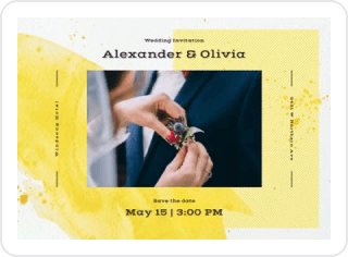
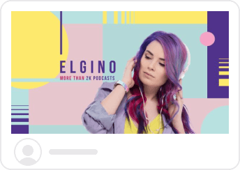
The vibrant combination of yellow and purple make it practically impossible for the user to look past this Facebook post. And that’s your social media colors theory in action.


Best colors to use on Pinterest
Top colors for Pinterest are: red, purple, and pink.

Pinterest is best known for its striking contrast between the following colors:
- #f5f5f5
- #fa1f1f
- #f46060
- #151010
- #aaaaaa
However, the Facebook logic is inapplicable in the Pinterest scenario. Albeit all the assumptions that images that use shades of red will blend in with the platform’s native colors, red-dominant pins get the most engagement!
According to a study from Georgia Tech that examined over 1,000,000 Pinterest images, and looked at the color trends between the highest and lowest shared images…
- Red, Purple, and Pink promote sharing.
- Green, Black, Blue, and Yellow all stop people from sharing.
These points are also backed by the results of a study by Curalate:
- The most repinned images have multiple colors.
- Very light and very dark images are not repinned as often.
- Completely desaturated images (grey) and completely saturated images have fewer repins than images that are more moderately saturated.
- Red pins get repinned more often than blue pins.


Best colors to use on Instagram
Top colors for Instagram are: shades of blue, pink, yellow.

- #8a3ab9
- #4c68d7
- #cd486b
- #fbad50
- #fccc63
Just like Pinterest, Instagram is an incredibly visual-centered social media platform. So, the right choice of social media colors can either make or break your Instagram post.
According to stats from Curalate,
- Images with blue as a dominant color perform 24% better on Instagram than those with high concentrations of red and oranges.
- Bright images perform 24% better on Instagram than dark images.
A study carried out by Pantone Color Institute, Fohr, and Visit Carlsbad has also identified the four colors that drive the most engagement on Instagram. If you want to rack up more Likes, comments, and saves on this social media platform, add Rose Dawn (a dusty pink), Ethereal Blue, Ocean Depths (a teal shade of blue), or Harvest Gold (a sandy yellow).
A study carried out by Pantone Color Institute, Fohr, and Visit Carlsbad has also identified the four colors that drive the most engagement on Instagram. If you want to rack up more Likes, comments, and saves on this social media platform, make Rose Dawn (a dusty pink), Ethereal Blue, Ocean Depths (a teal shade of blue), or Harvest Gold (a sandy yellow) your go-to social media colors.


Best colors to use on Twitter
Top colors for Twitter are: yellow, black, blue, and white.

- #0084b4
- #00aced
- #1dcaff
- #c0deed
- #ffffff
Twitter is a social media platform that limits its users to only 240 characters per Tweet, so you need to keep your copy short and straight to the point. It might feel a wee restricting. But no worries — you can amplify your posts tenfold by using the right imagery and the right social media colors, in particular.
According to research conducted by Teodora Dobre, the most-used colors on Twitter are:
- Yellow: 25.92%
- Black: 22.22%
- Blue: 14.81%
- White: 11.11%
- Green: 9.25%
- Purple: 7.40%
- Orange: 5.55%
- Red: 3.74%
There’s quite a range in this list of social media colors — it shouldn’t be a problem that works for you.
Regardless of what platform you choose for your social media marketing, make sure you know how to use design to sell more — find out all about it in our article! Then, feel free to experiment with visuals, colors, and formats.


